Letterpress pressure print
For the pressure print project in my letterpress class, students were tasked with creating a pressure relief print using the letterpress that conceptually represented the universe. After producing 25 editions, we then set metal type to complement the composition with a narrative element. I drew inspiration from Norwegian creation myths, using their themes as a foundation to explore my own experiences at this point in time.

Initial tests


Before setting out to print the final product I tested the layering and shape capabilities of the pressure printing process. I tested several Ideas from various sketches (seen bleow)


Printing template

My intention with this design was to draw from Norwegian mythology, specifically Hati and Sköll—the wolves that chase the sun and moon—to represent duality within the universe. I was intrigued by how my ancestors used fantastical imagery to contextualize their own experiences, and I sought to do the same. By depicting themes of balance and opposition, I aimed to create a visual narrative that reflects a broader, universal experience of duality.
The making process involved me drawing templates, and then cutting each element out of different materials by hand. I used materials like glitter paper and blank sticker paper to create contrasting textures that embody the textures of space and planets. The template is heavily layered to create a level of visual interest and intrigue, while engagaing with the medium of pressure print in an effective way.

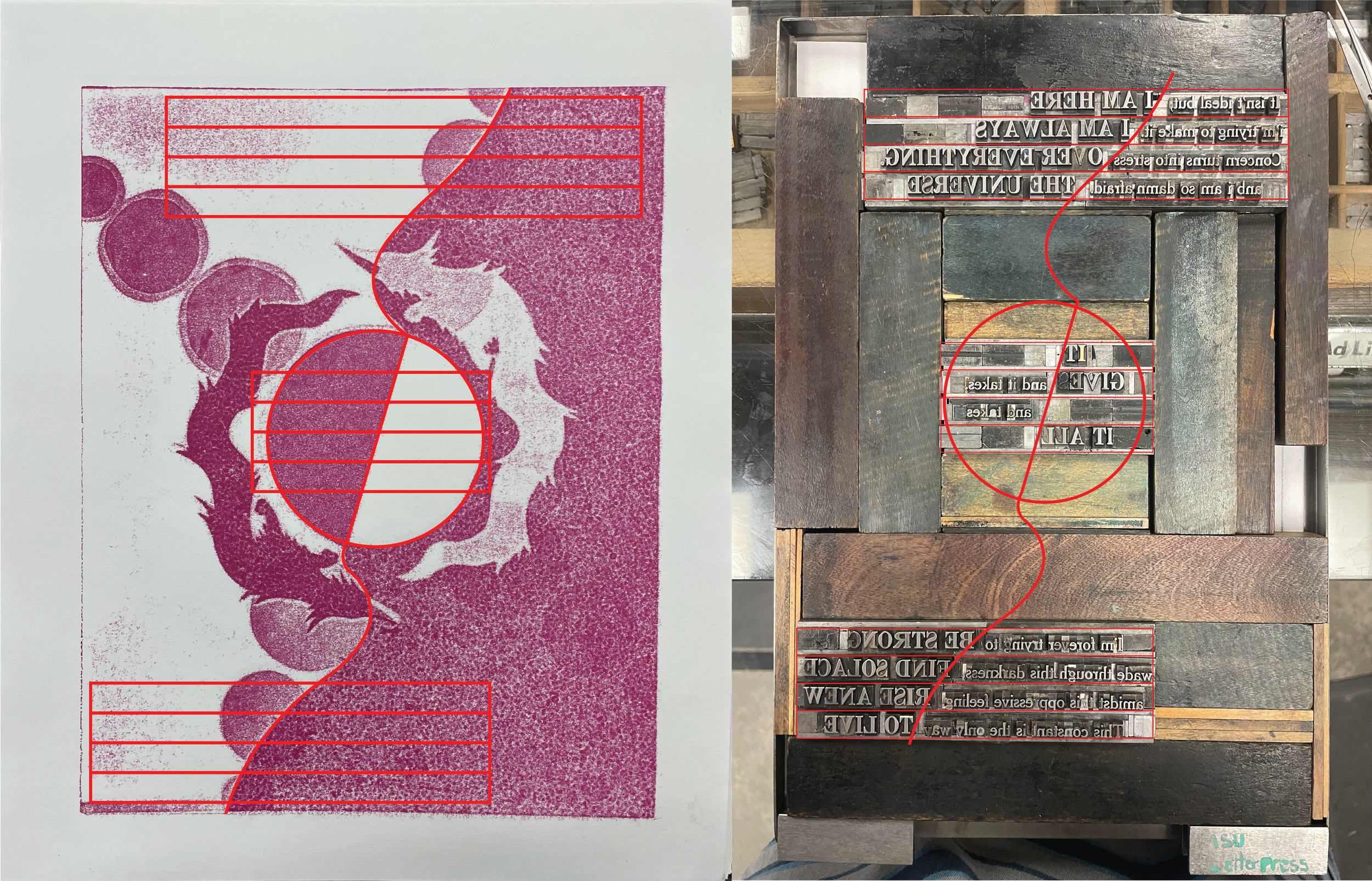
Typesetting and message
I aimed for the typesetting to visually reinforce the duality expressed in the imagery. To achieve this, I created two separate blocks of text in distinct styles—each conveying a different perspective: one nihilistic, the other idealistic. These messages could be read individually or together, emphasizing the contrast between opposing worldviews. The goal was to illustrate how meaning emerges not from one extreme or the other, but from the interplay of good and bad, weakness and strength, light and dark. I arranged the type to flow harmoniously with the existing forms, ensuring it complemented rather than overpowered the composition. I selected two contrasting type sizes and styles, a choice that was challenging to execute physically but essential in reinforcing the theme of duality. The larger type is bold, overt, and commanding—representing ideas that are obvious and widely recognized. In contrast, the smaller type is subtle, reserved, and almost hesitant, embodying thoughts that are less acknowledged or obscured. This interplay between the two mirrors the broader concept of balance and coexistence within the universe.

Sketches and other concepts


My new relationship with typography
Before taking this letterpress class, I often struggled with selecting the right typeface for each project. However, through the hands-on experience of setting type manually and spending long hours refining my choices, I developed a much deeper, more personal relationship with typography—officially earning the title of “type nerd.” This process has sharpened my understanding of the subtle formal qualities of type and how they interact with the overall messaging of a design. Now, I approach typography with a more informed and intentional perspective, ensuring that every type choice reinforces the visual and conceptual goals of my work.