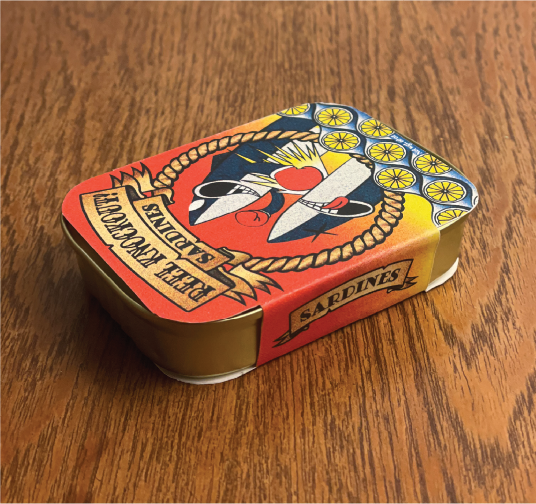
Sardine belly band
For this assignment in my package design class, I was tasked with creating a sardine brand and packaging specifically tailored to a millennial audience. The goal was to challenge the common perception of sardines as smelly, unappealing, and outdated, instead presenting them as an exciting, modern, and desirable food choice. The design had to incorporate a belly band—a cost-effective and widely used packaging method for sardines—while effectively communicating the brand’s fresh and contemporary appeal.

Design intention and dieline
For my design, I drew inspiration from a fusion of American traditional tattoo aesthetics and classic cartoon styles—both rich in nostalgia and deeply resonant with millennials as they’ve re-emerged in contemporary culture. The imagery incorporates nautical motifs from traditional tattooing, such as a compass, flags, knots, and the typeface chosen reinforcing the sardines' connection to the ocean. At the same time, the design embraces the bold, grainy textures, blocky colors, and punchy visuals reminiscent of vintage cartoons.
The color palette was carefully chosen to be eye-catching on a shelf while instantly communicating the sardines' sweet flavor. Additionally, the compass serves as a functional design element, acting as a flavor indicator that could be seamlessly applied across future product variations.

To ensure a perfectly fitting dieline, I analyzed contemporary grocery store packaging, carefully dissecting and measuring various designs. This research allowed me to develop my own original dieline tailored specifically to the rounded rectangular can I selected.

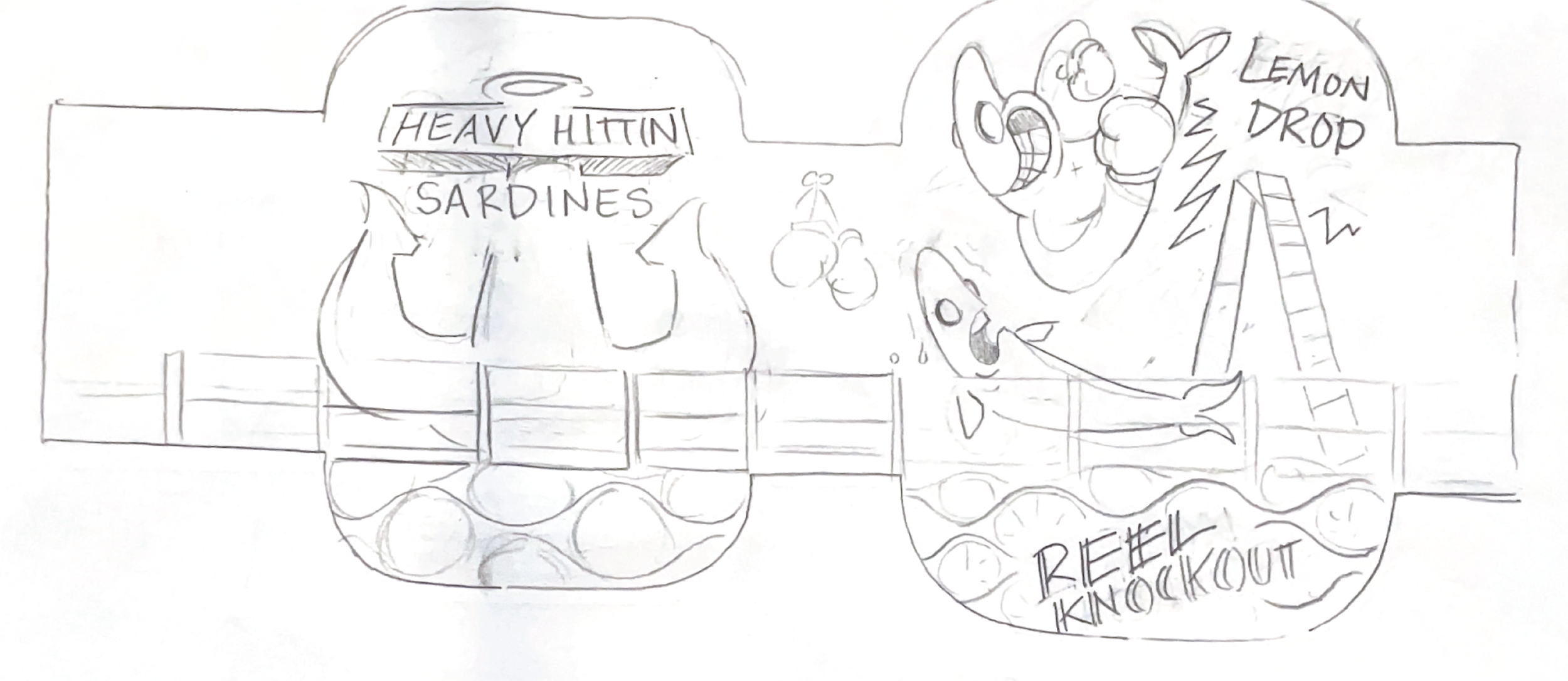
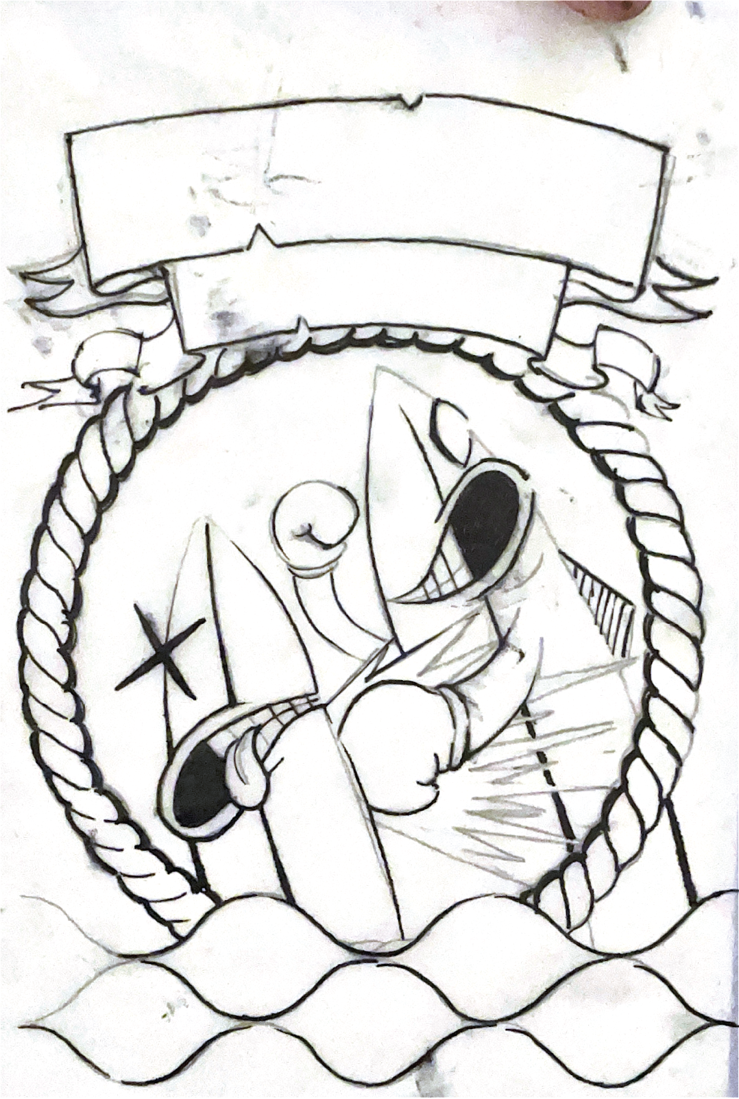
Process sketches
The entire design was built from hand-drawn elements, staying true to my personal process. I often use drawing as a way to quickly mock up ideas, providing art directors, teachers, or clients with a clear visual direction before moving into final production.