Content advisory:
This project contains strong language and bold messaging intended to challenge industry norms. Viewer discretion is advised.
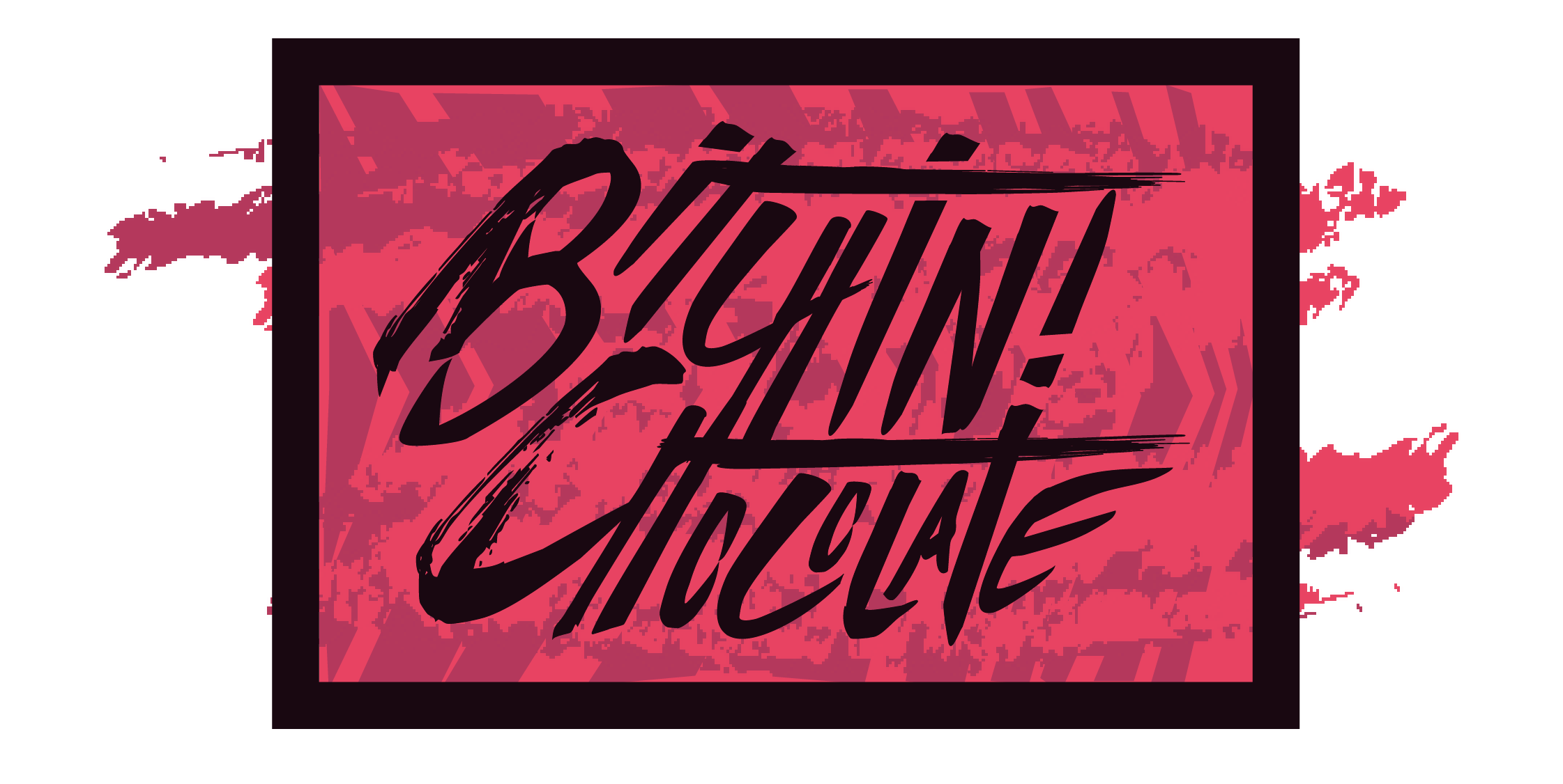
Chocolate Branding
For the chocolate branding project in my package design class students were tasked with creating a brand identity and package design that caters to a specific demographic of our choosing. at the time I was really inspired by the brand “tonys chocolonelys” ability to capture the attention of the gen z demographic through its promotion of fair trade. My goal was to create a fair trade chocolate brand that boldly and unapologetically calls out the inequities of the chocolate industry. Instead of following the family-friendly, approachable design trends used by major chocolate corporations, I wanted to break away from those sensibilities and create packaging that is direct, disruptive, and visually striking. The result is a brand identity that not only appeals to a socially conscious Gen Z audience but also challenges the unethical practices of the chocolate industry head-on.
Design intention and Dieline
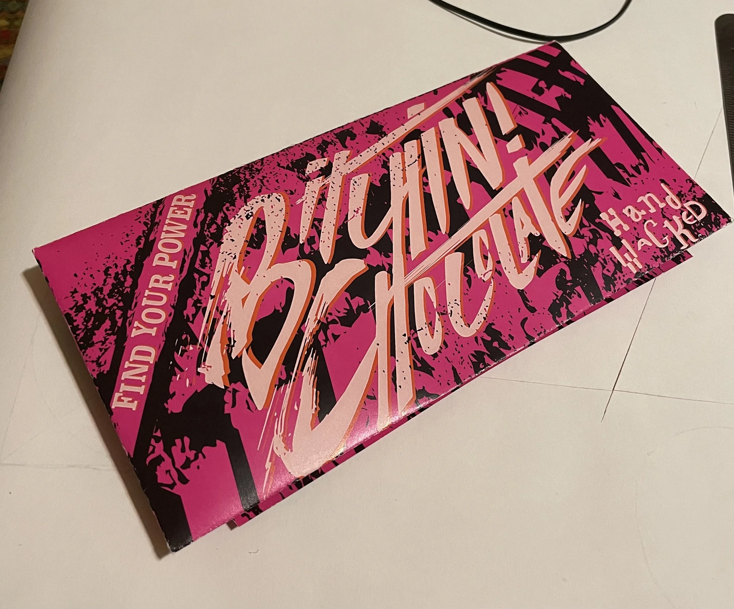
For this design, I aimed to create packaging that immediately grabs attention with deeply saturated colors and high-contrast elements. The hand-drawn typography is raw and energetic, emphasizing human craftsmanship while delivering a bold message that demands engagement.
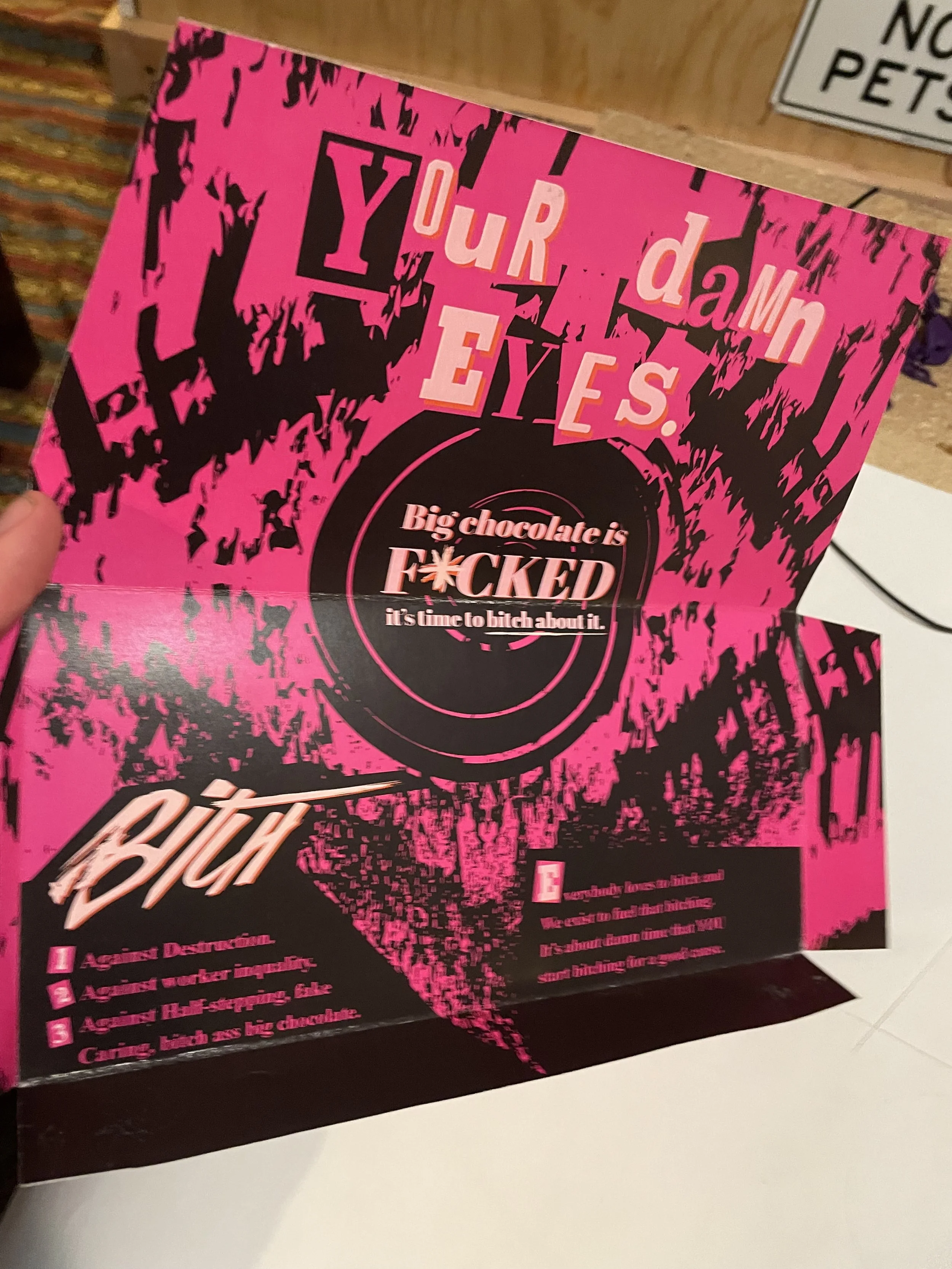
I pushed the aesthetic further with a grunge-inspired approach, visually reinforcing an anti-industry stance. The design is messy, abrasive, and unapologetically bold, rejecting the clean, corporate polish of mainstream chocolate brands. The disjointed typography—featured on both the interior and back—references the anti-capitalist art movements of the ‘60s, pioneered by Pop artists, and the raw, rebellious energy of punk movements from the ‘80s, like those fueled by the Sex Pistols. By merging these influences, the design challenges the status quo while forging a direct connection with Gen Z’s values and visual language.

Design intention and Dieline
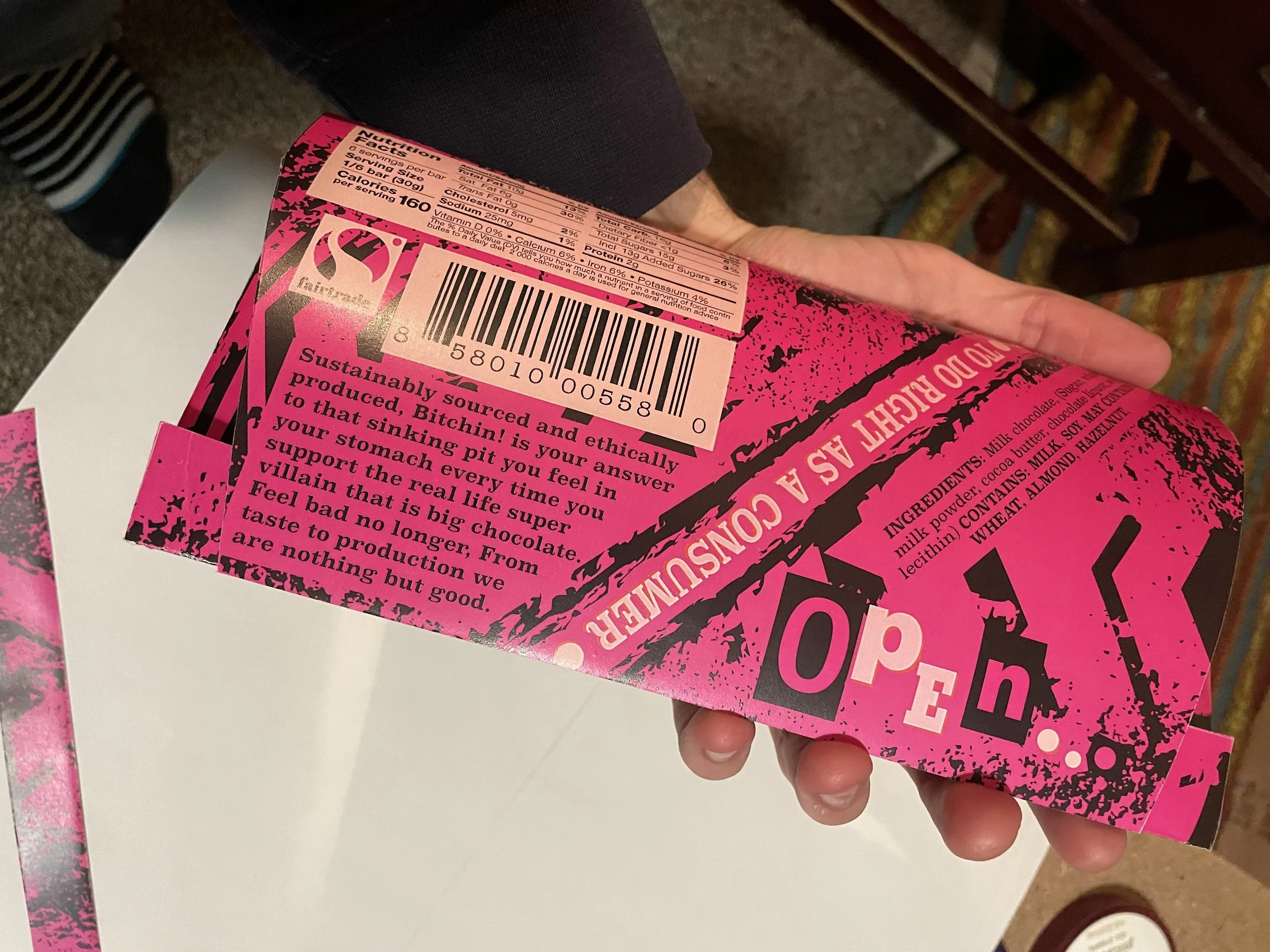
I put a lot of thought into the viewing experience of the package. The bold design grabs attention, making someone pick it up—but the real message unfolds as they interact with it. The phrase "open..." on the back connects directly to the inside, completing the statement: "open... your damn eyes." Once opened, the package delivers a deeper explanation of exactly what it’s “bitchin” about—the harsh realities of the chocolate industry.
"Bitchin! Chocolate" earns its name in two ways: it’s cool, rebellious, and speaks directly to a Gen Z audience, but it’s also literally “bitchin” for a cause—calling out the injustices of the chocolate trade and demanding change.
Color variations and sketches


How this design changed my life
During the design process, I was initially inspired by Tony’s Chocolonely, but as I dug deeper into research, I uncovered the atrocities of the big chocolate industry. Learning about the widespread exploitation—forced labor, child labor, and environmental destruction—deeply affected me. I felt ashamed for having unknowingly supported such an industry for 23 years.
I poured countless hours into this project, fully immersing myself in its politics and messaging. By the time I finished, I realized I couldn’t just stand by—I’ve since vowed to never support unfairly traded chocolate again. This project wasn’t just about design; it changed the way I think and consume.