Coming soon: Historic type study and Print for a Montana cause
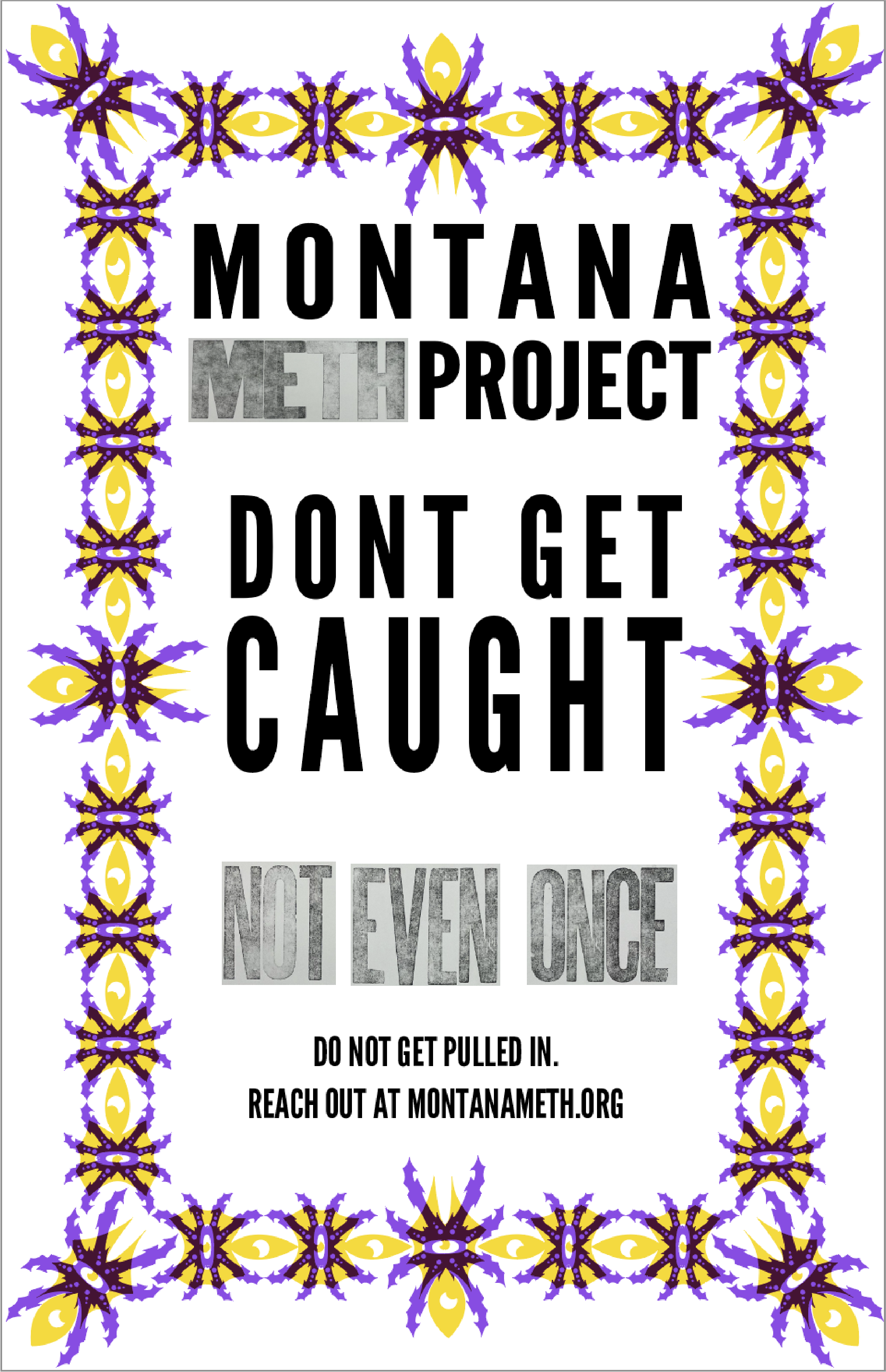
This project is currently in its final stages — the final physical printing and documentation are underway and will be completed by Wednesday April 9th 2025. The concept and design work are fully developed, and a full case study will be added shortly. below is a digital mockup of the final printed design to come.
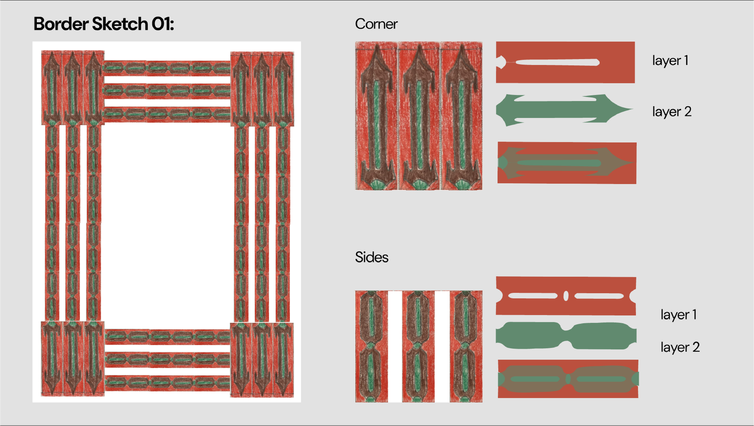
In the Historic Type Study and Print for a Montana Cause project in my letterpress class, I was tasked with studying a historic type specimen and using its formal qualities to inspire a chromatic border, which I then used for a poster design promoting a cause in Montana. A chromatic design in printing involves the layering of two separate color elements that overlap to create a third color.
Historic typography study
The typographical specimen I studied for this project was Antique Tuscan—a bold, dramatic, and highly decorative typeface originally popularized during the Victorian era for posters and promotional materials. While it was initially intended to add a sense of playfulness and flair, in a contemporary context it often reads as more aggressive and sharp.

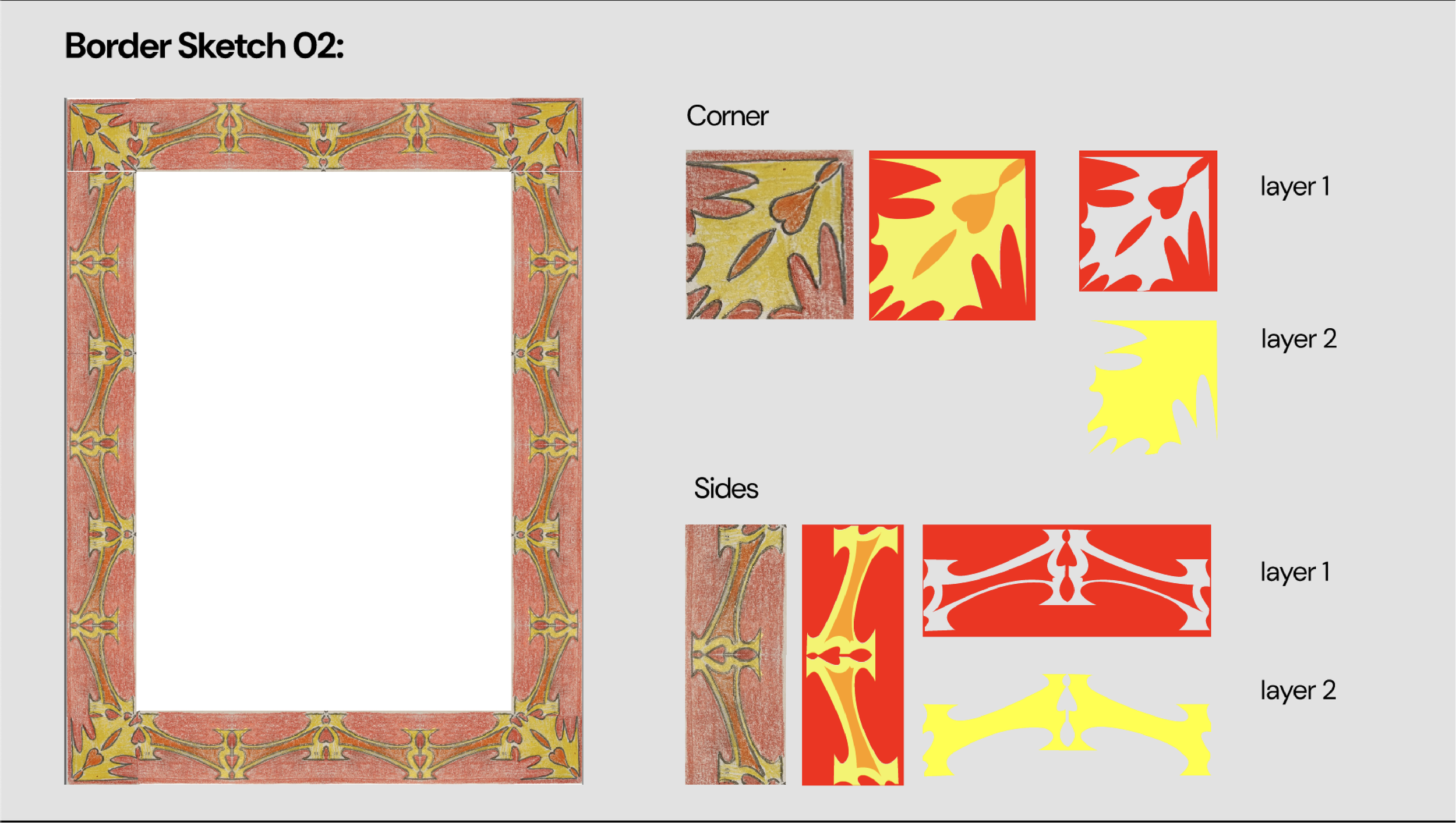
5 Initial concept sketches for Montana meth project and mothers against drunk driving
Due to the typography’s bold and aggressive forms, I was inspired to design for a cause such as MADD or the Montana Meth Project. I saw a strong connection between the visual intensity of the typeface and the bold, urgent messaging required by both of these campaigns.

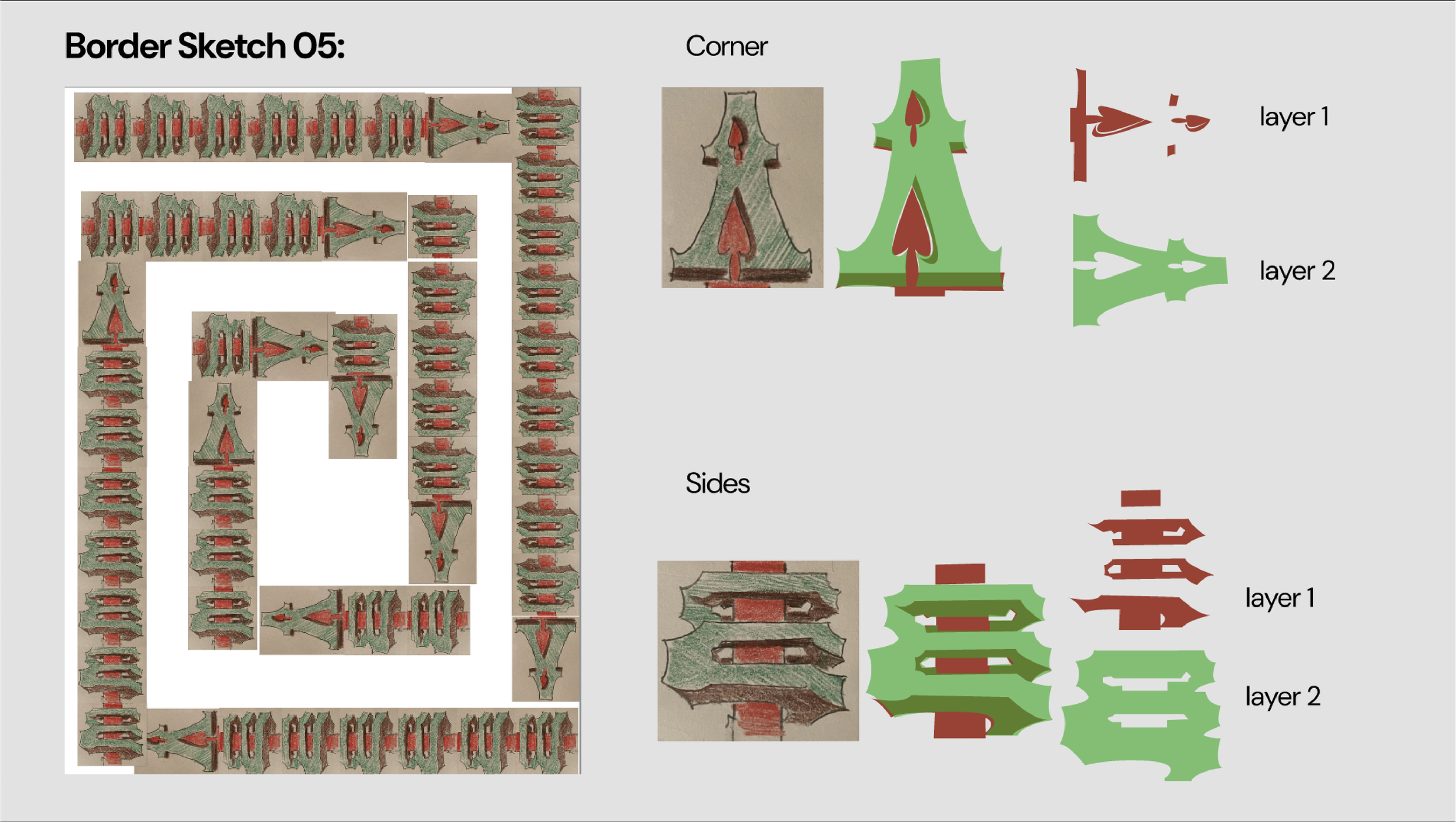

5 refined sketches for Montana meth project
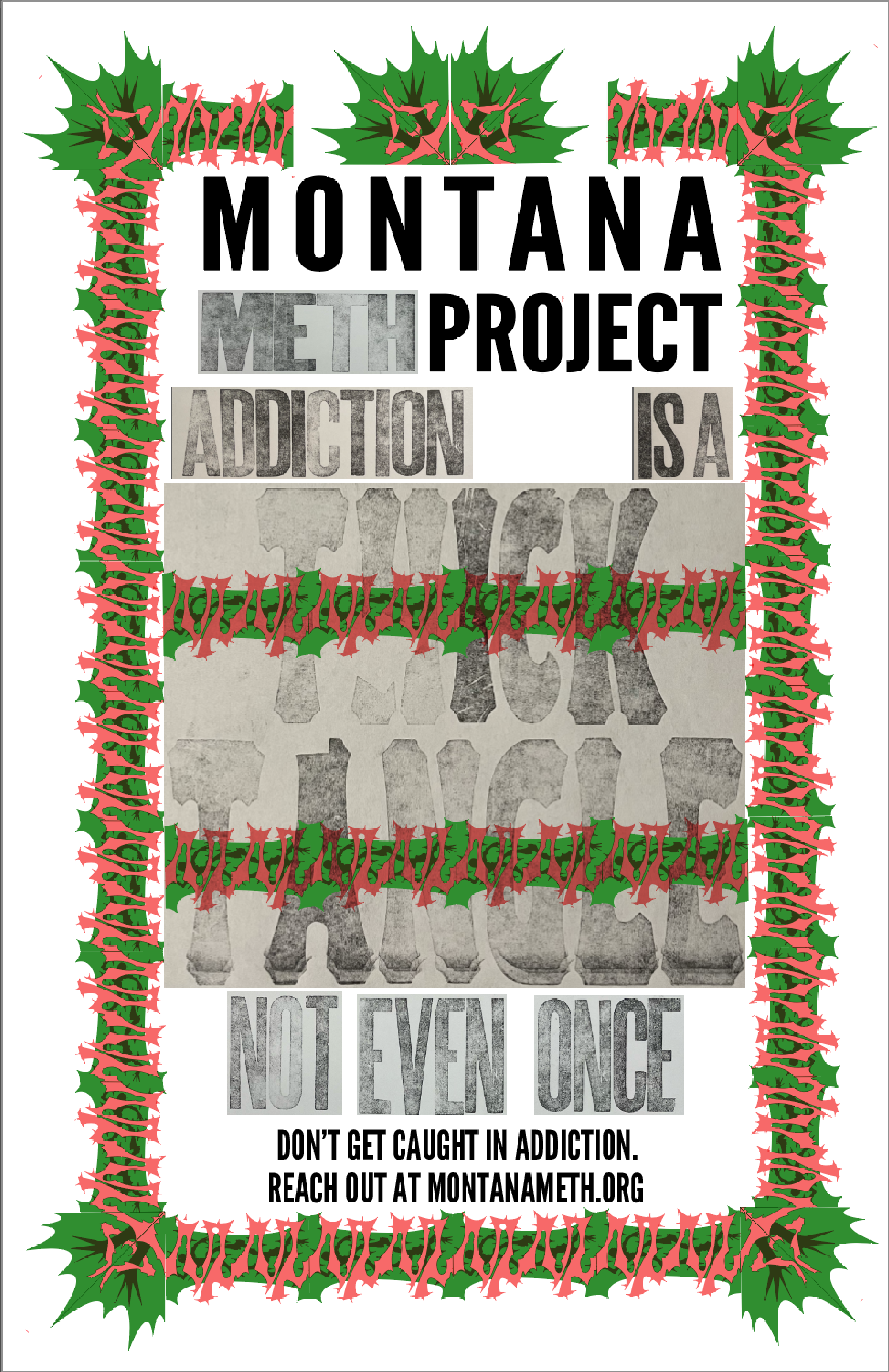
I decided to move forward with the Montana Meth Project for my border design, as it offers a deeper and more specific connection to place than MADD. In my refined sketches, I drew inspiration from the Montana Meth Project’s use of shocking and impactful imagery. I chose to develop the concepts from initial sketches 1 and 5 (shown below as sketches 1 and 2), as they presented strong visual ideas. For the remaining three sketches, I pushed the imagery further, focusing on themes that resonate more deeply with Montanans—specifically, environmental and nature-focused imagery.


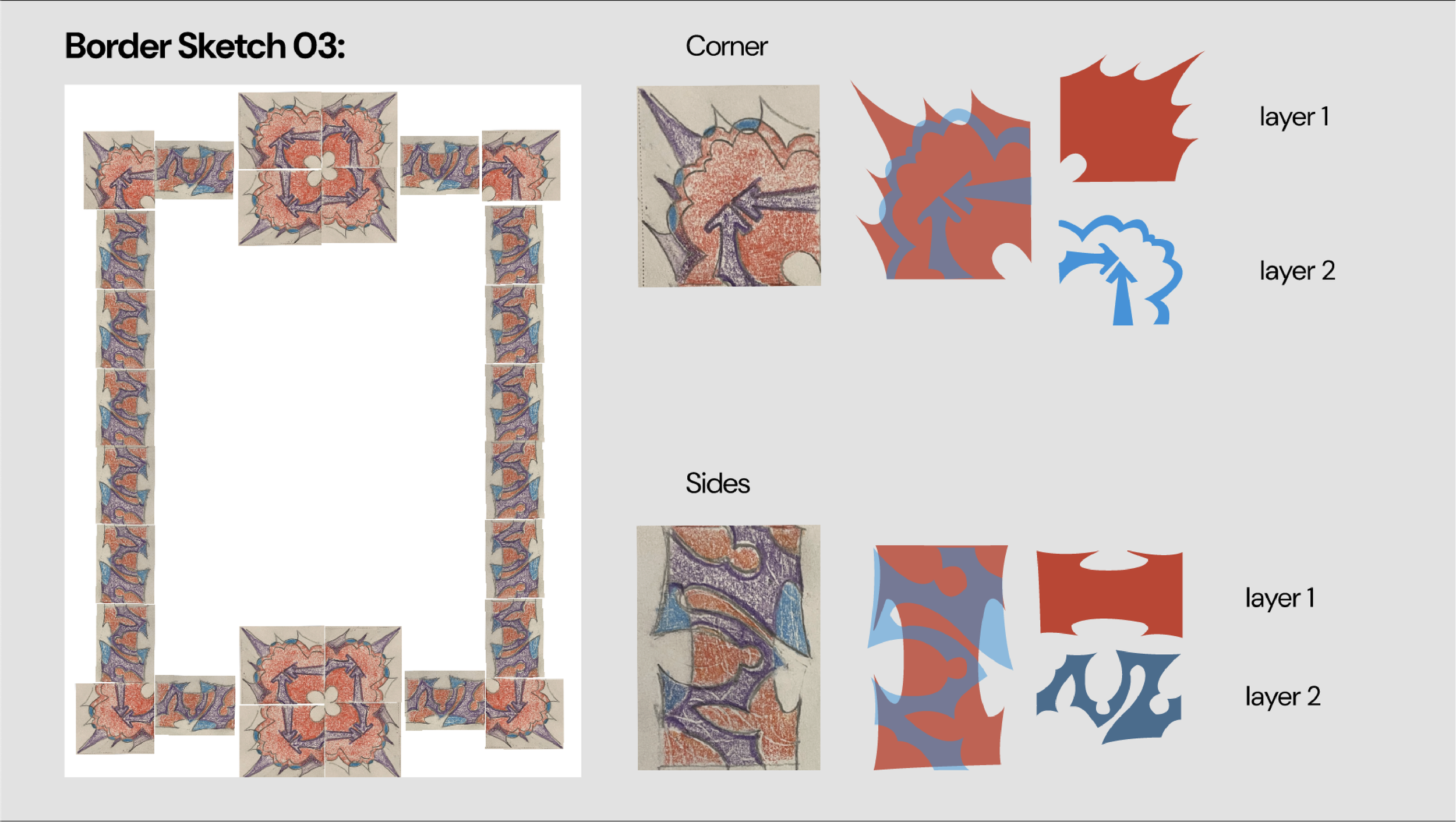
Final decision and laser cutting
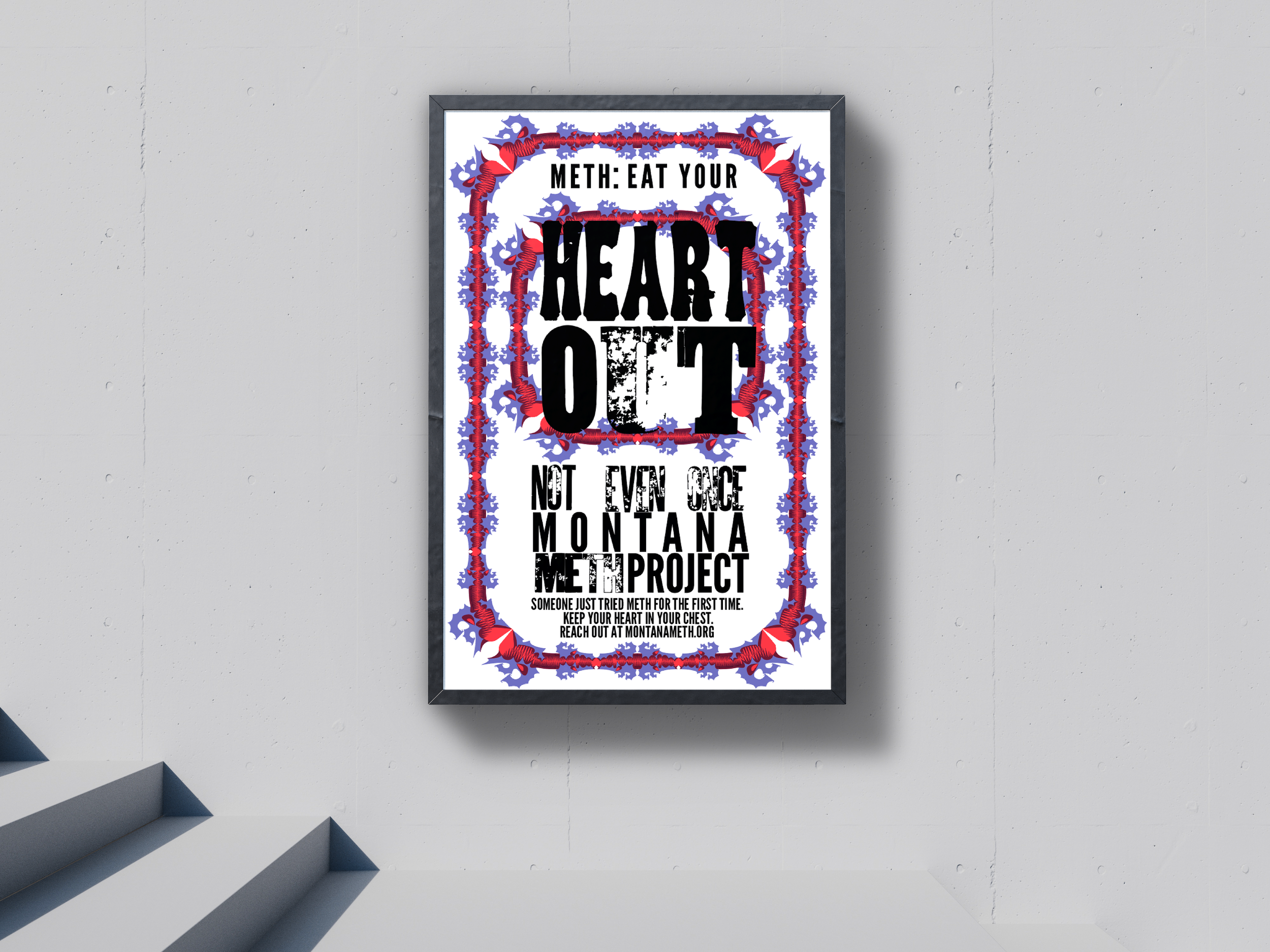
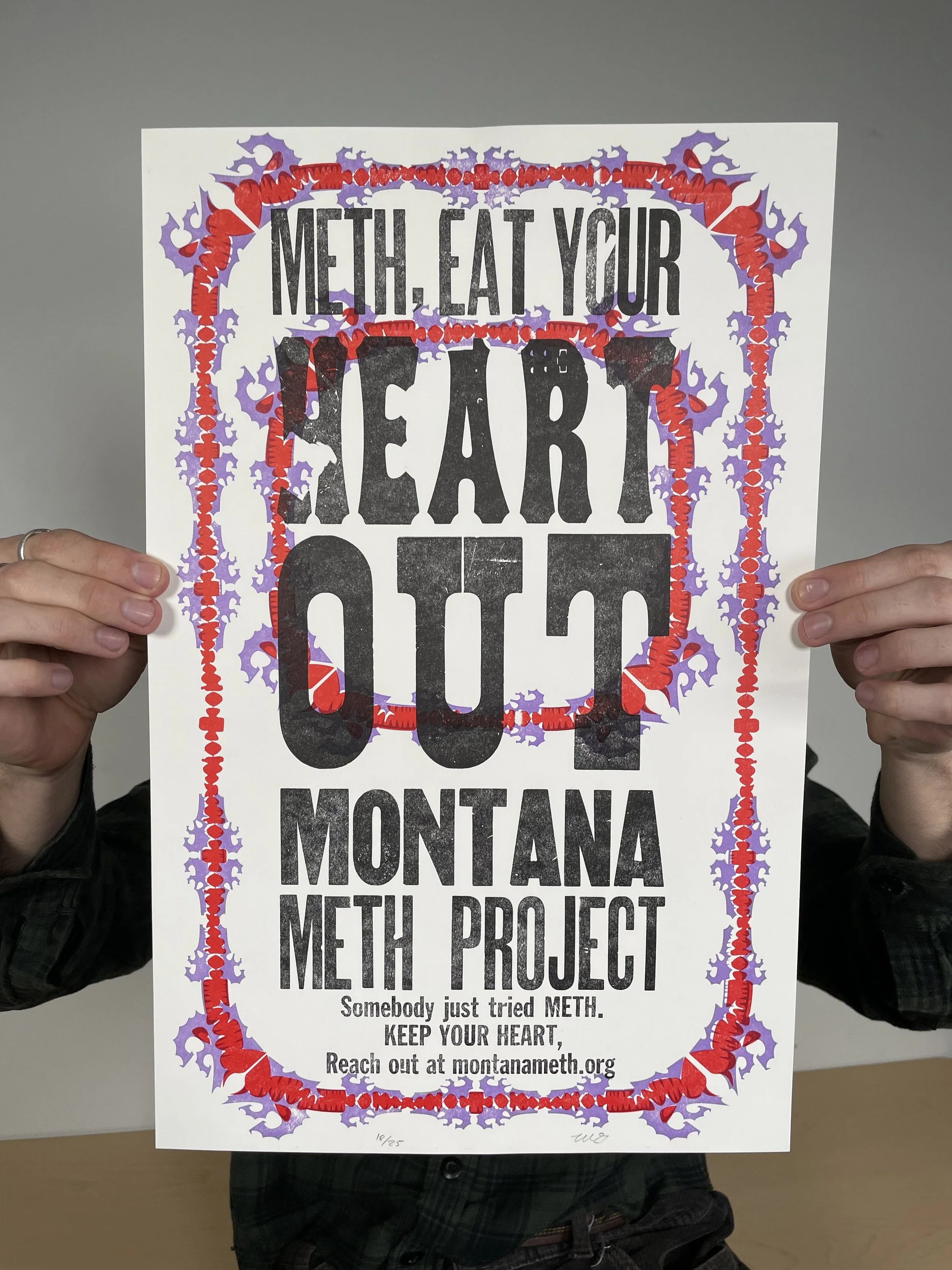
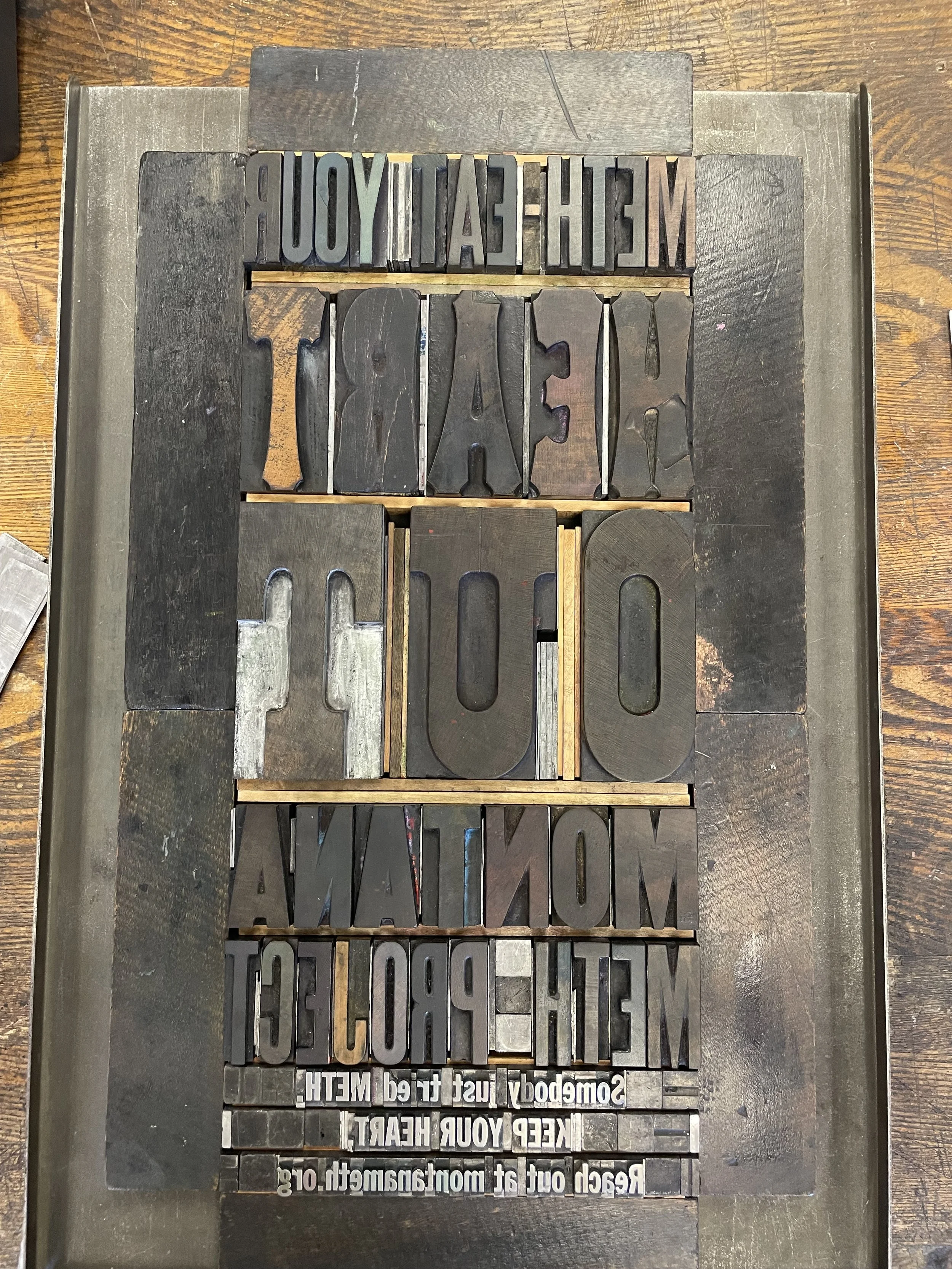
I decided to move forward with design number 5: "Meth: eat your heart out." I was drawn to this concept because of its visceral, eye-catching imagery that not only grabs attention from a distance but also offers deeper layers of meaning upon closer inspection. The design features abstracted rabid dogs tearing apart a heart, creating a striking visual that plays off the metaphor embedded in the typography. The phrase “eat your heart out” serves as a callout to meth, suggesting that meth would be envious of the dogs' ability to literally and metaphorically destroy a human heart.
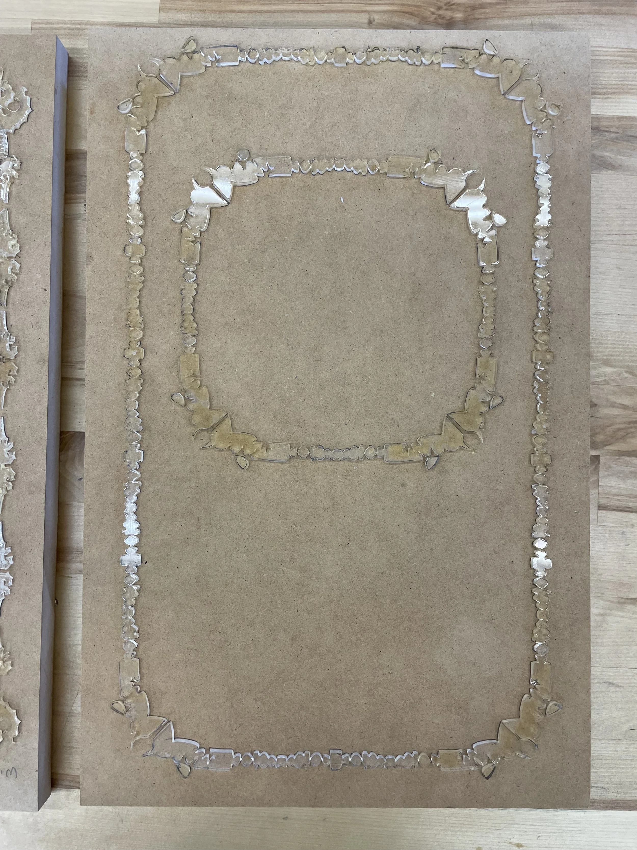
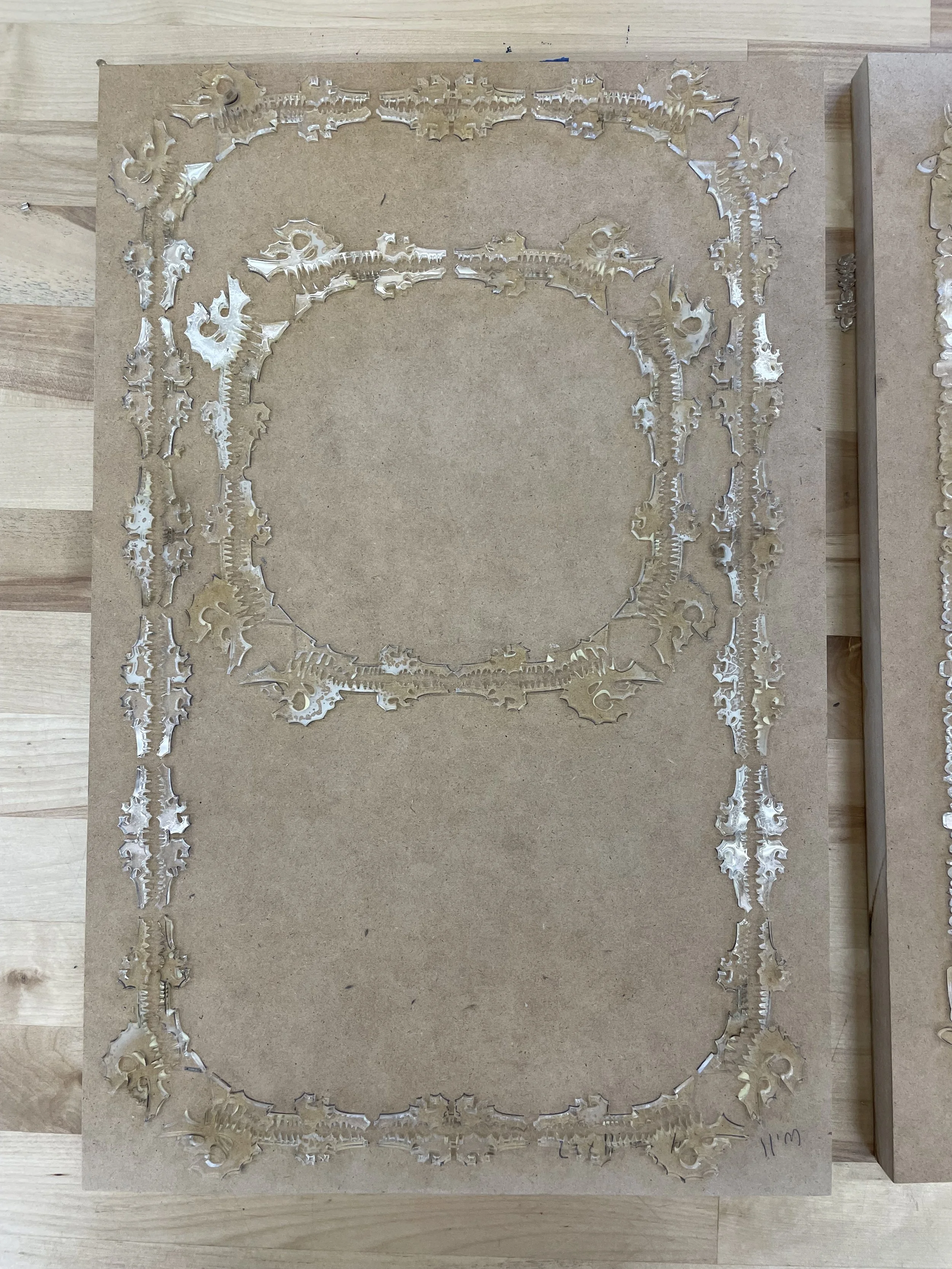
The choice of deep lavender and red creates a high-contrast color palette, enhancing the visual impact and ensuring the overlay is distinctly visible. After finalizing the design, I split the file into two layers and proceeded with laser cutting the forms out of plexiglass, which will be used for the final printing process.

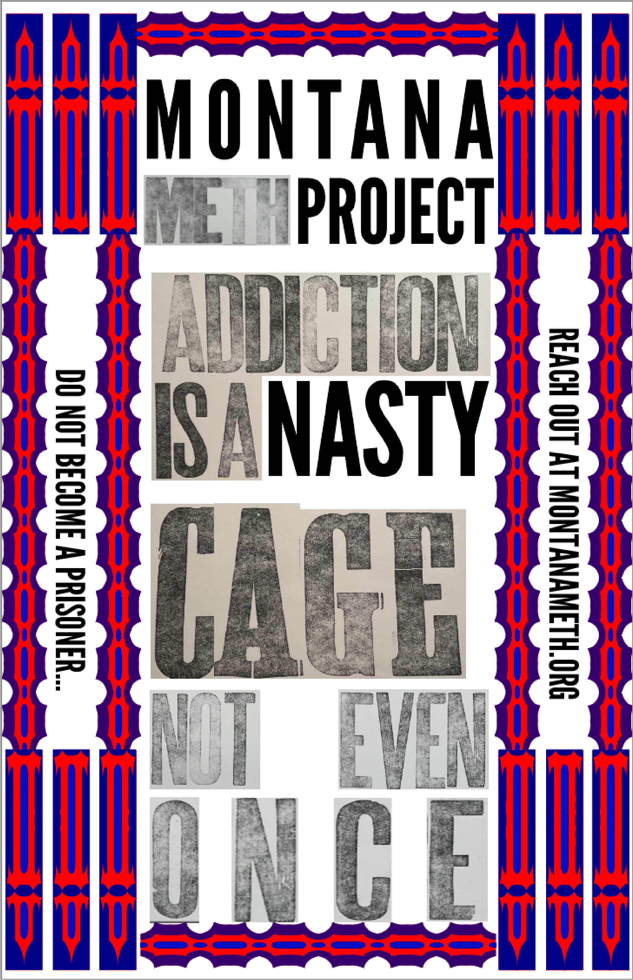
Final Printing and poster
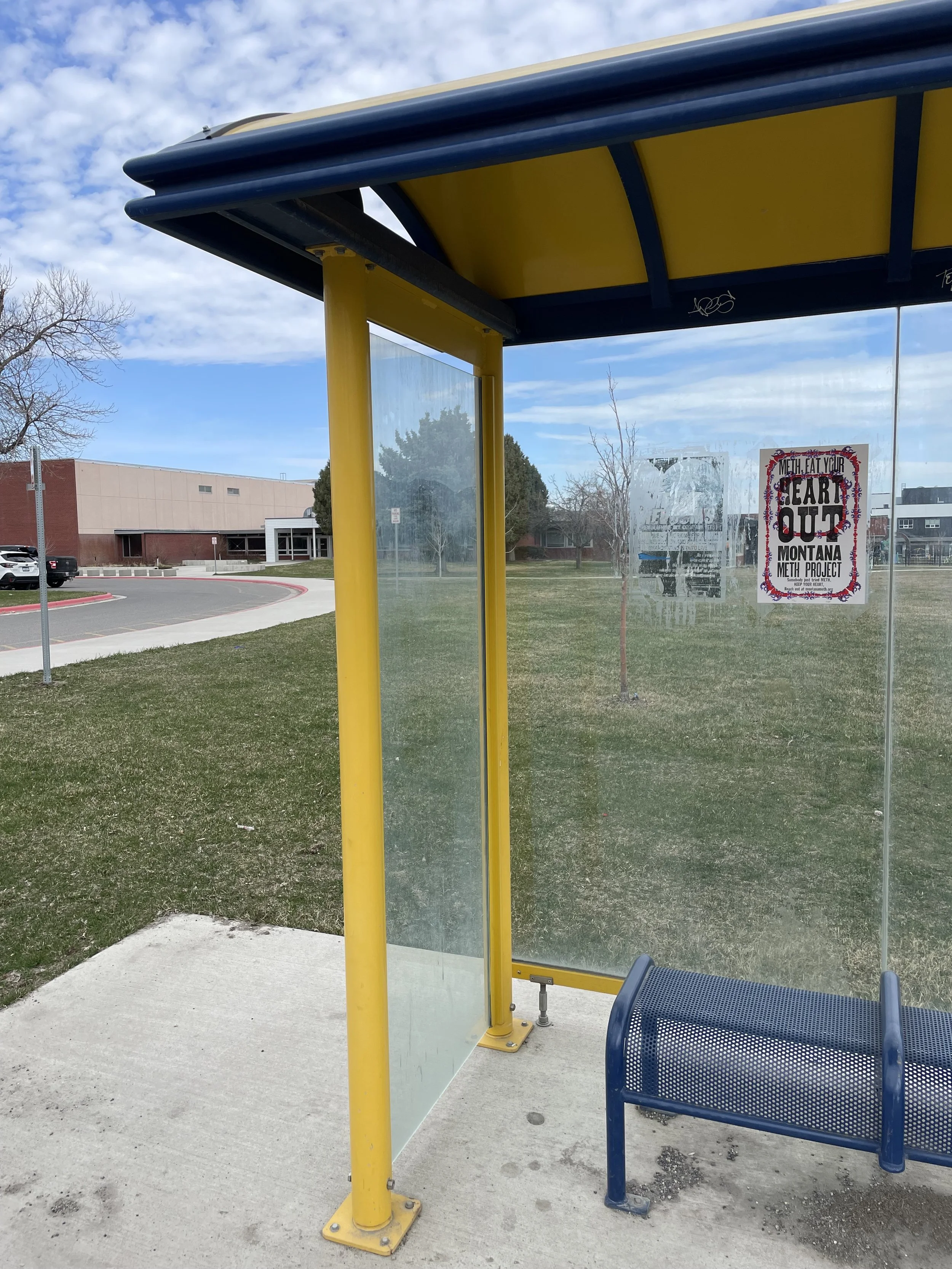
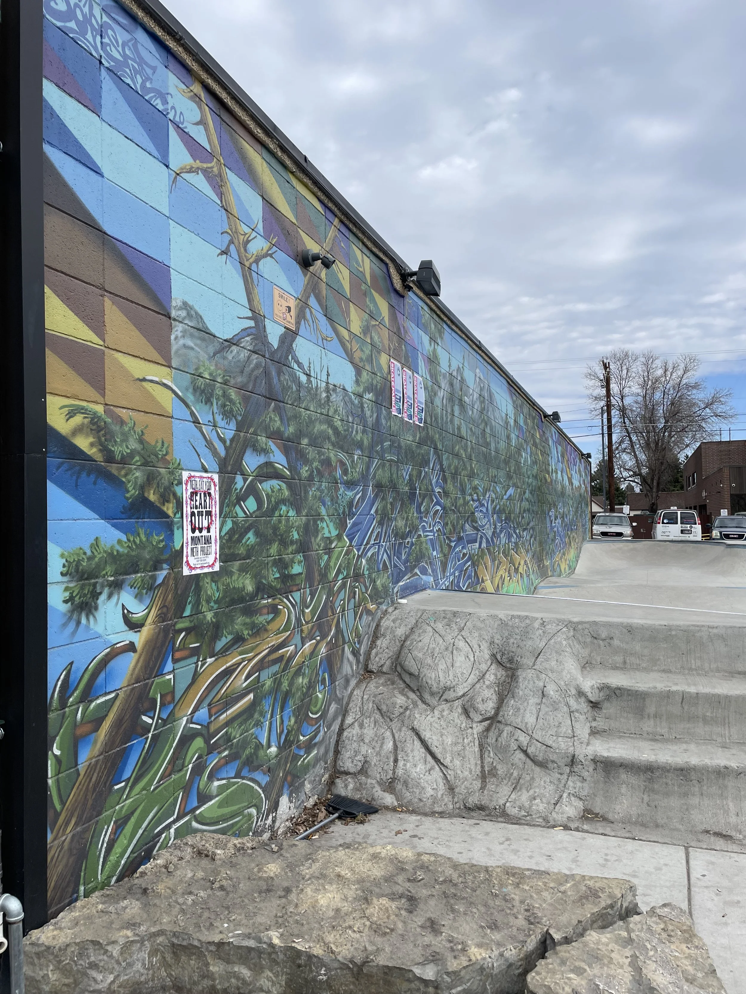
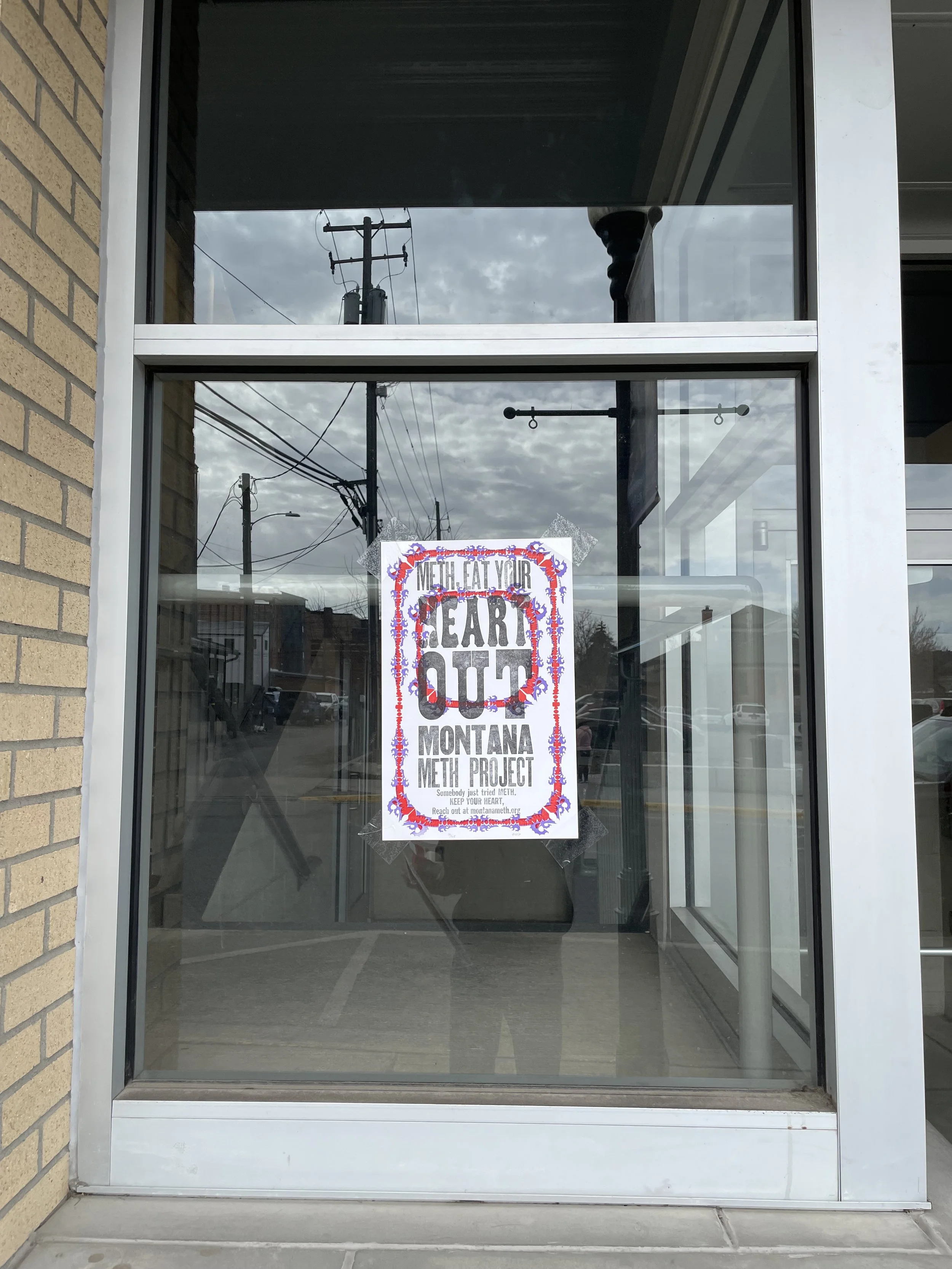
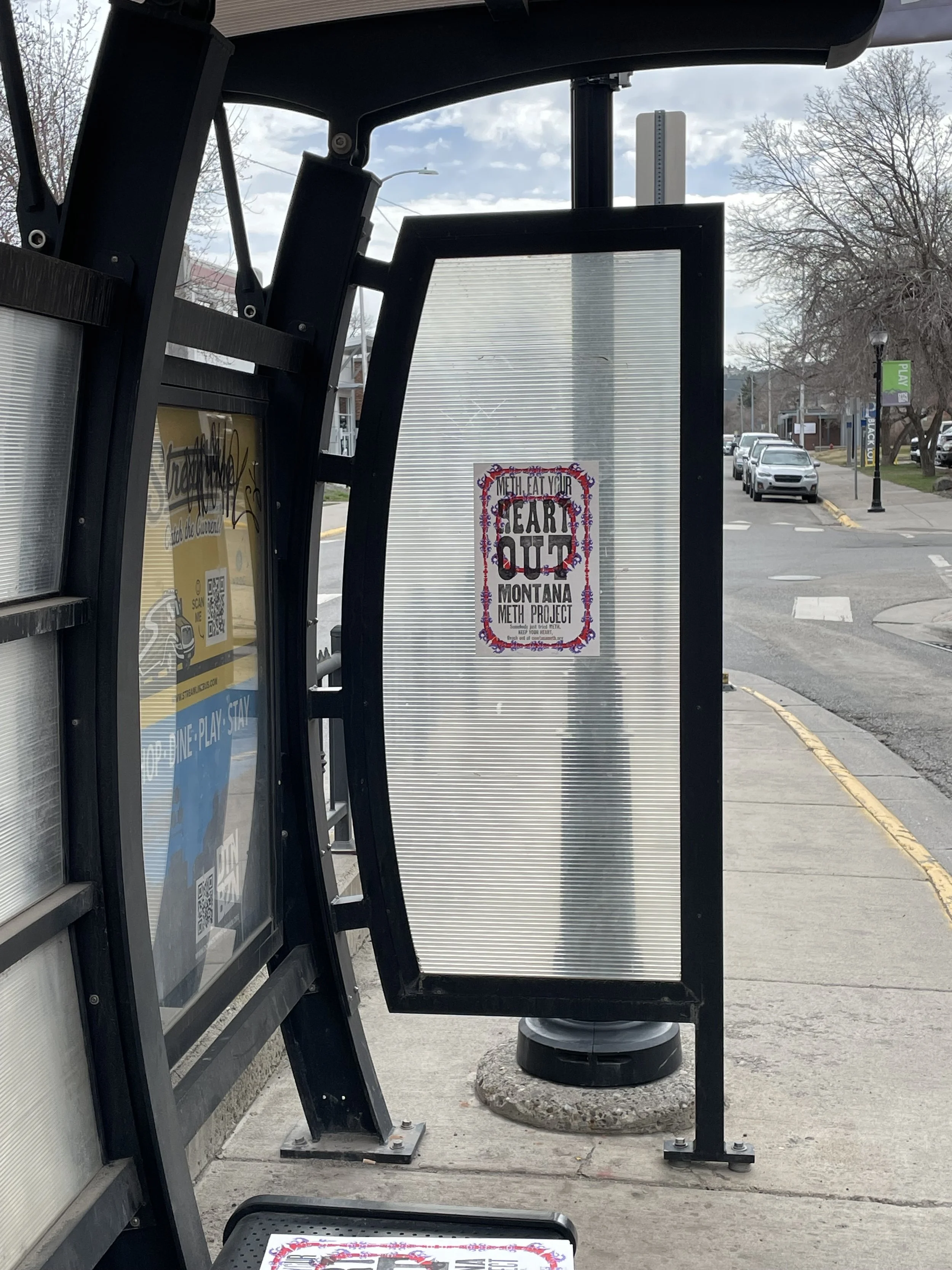
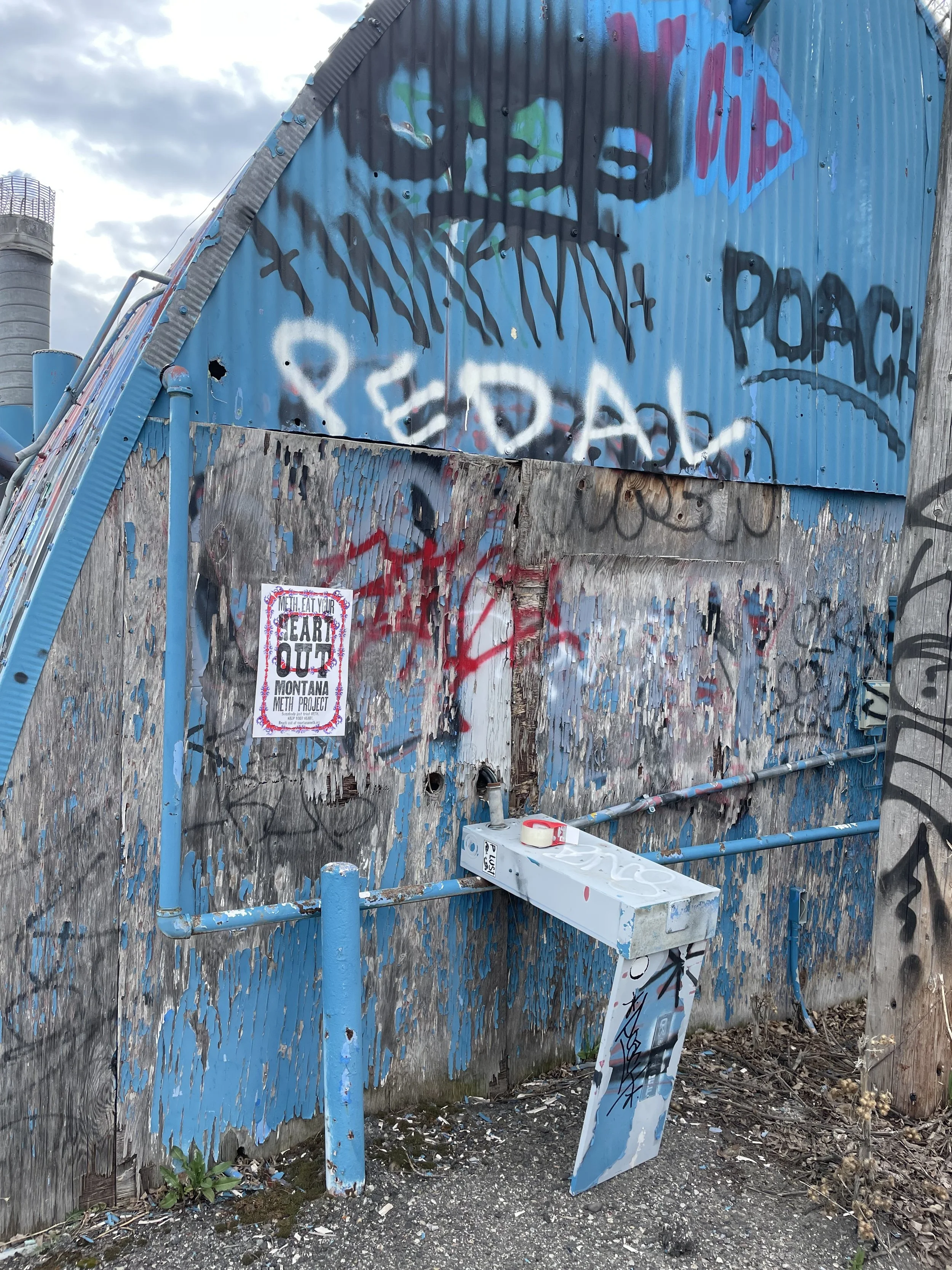
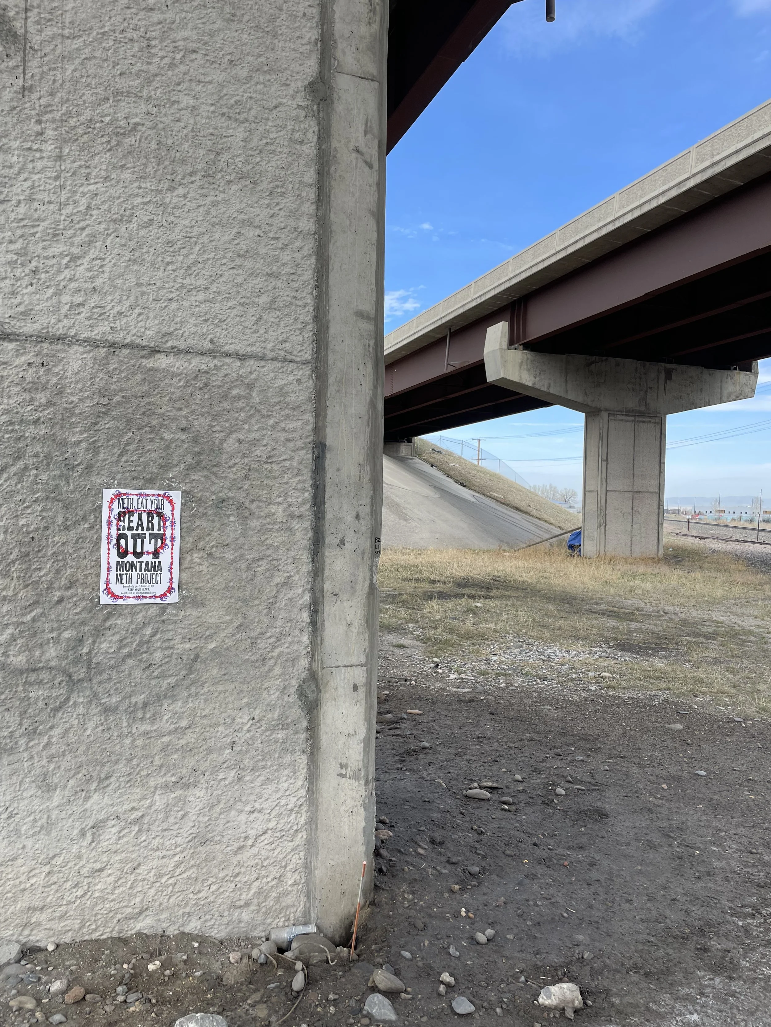
For the final step in this project, I was tasked with distributing my poster editions throughout the Bozeman community. I aimed to be intentional about where I placed these posters, selecting locations that would maximize their relevance and impact. I chose bus stops, under bridges, skate-parks, graffiti walls and parking garages—areas often frequented by the homeless community, a group particularly vulnerable to the harmful effects of meth.
Additionally, I brought my posters to the HRDC Food Bank, where I received a very positive response. The staff appreciated the message and design so much that they requested copies to use and distribute further within their outreach efforts.