Posterfold Design
For my first project in my form and content class, I was tasked with making a foldable poster design for a festival of my choice. The goal of this project was to create a strong poster cover that captures the identity of the festival, which should be extrapolated to the back cover in a manner that pushes forth the concept as a whole.
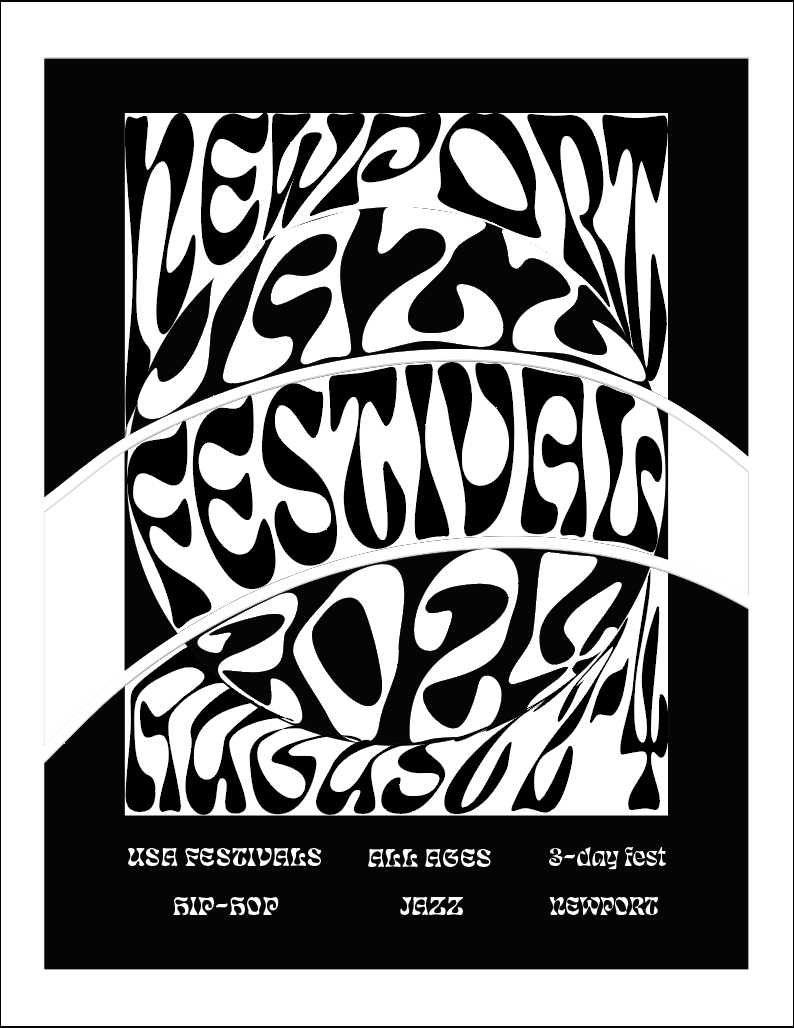
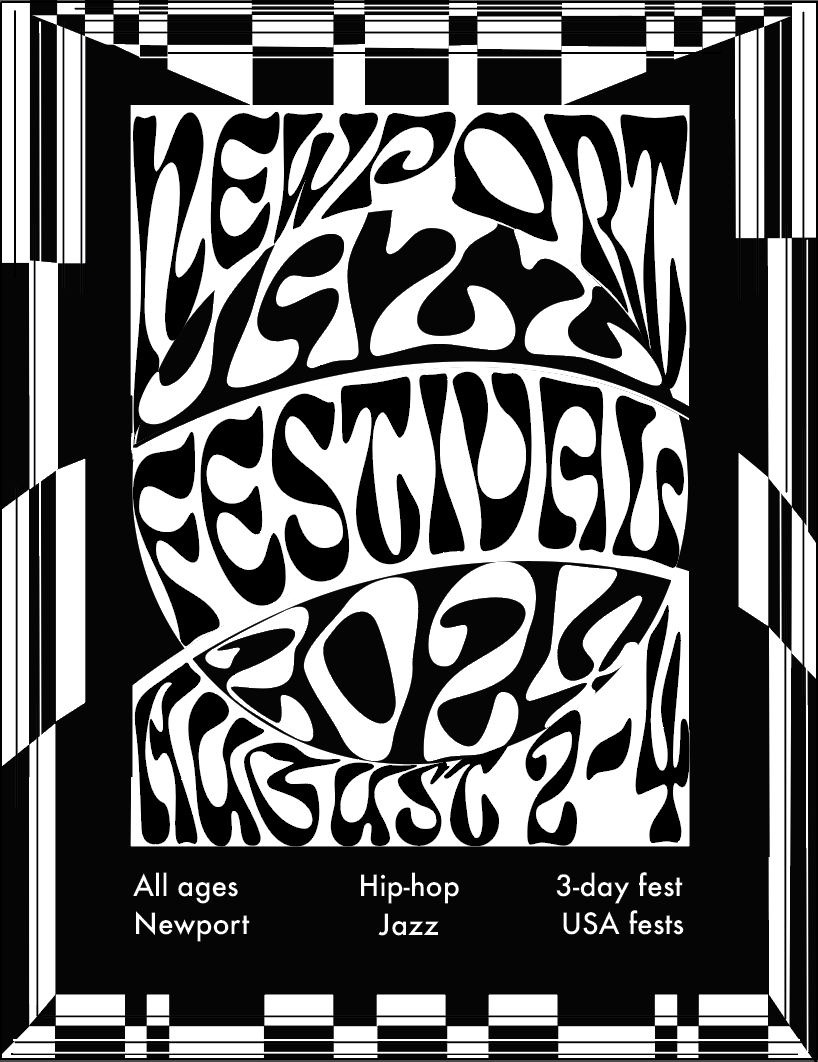
Front Cover
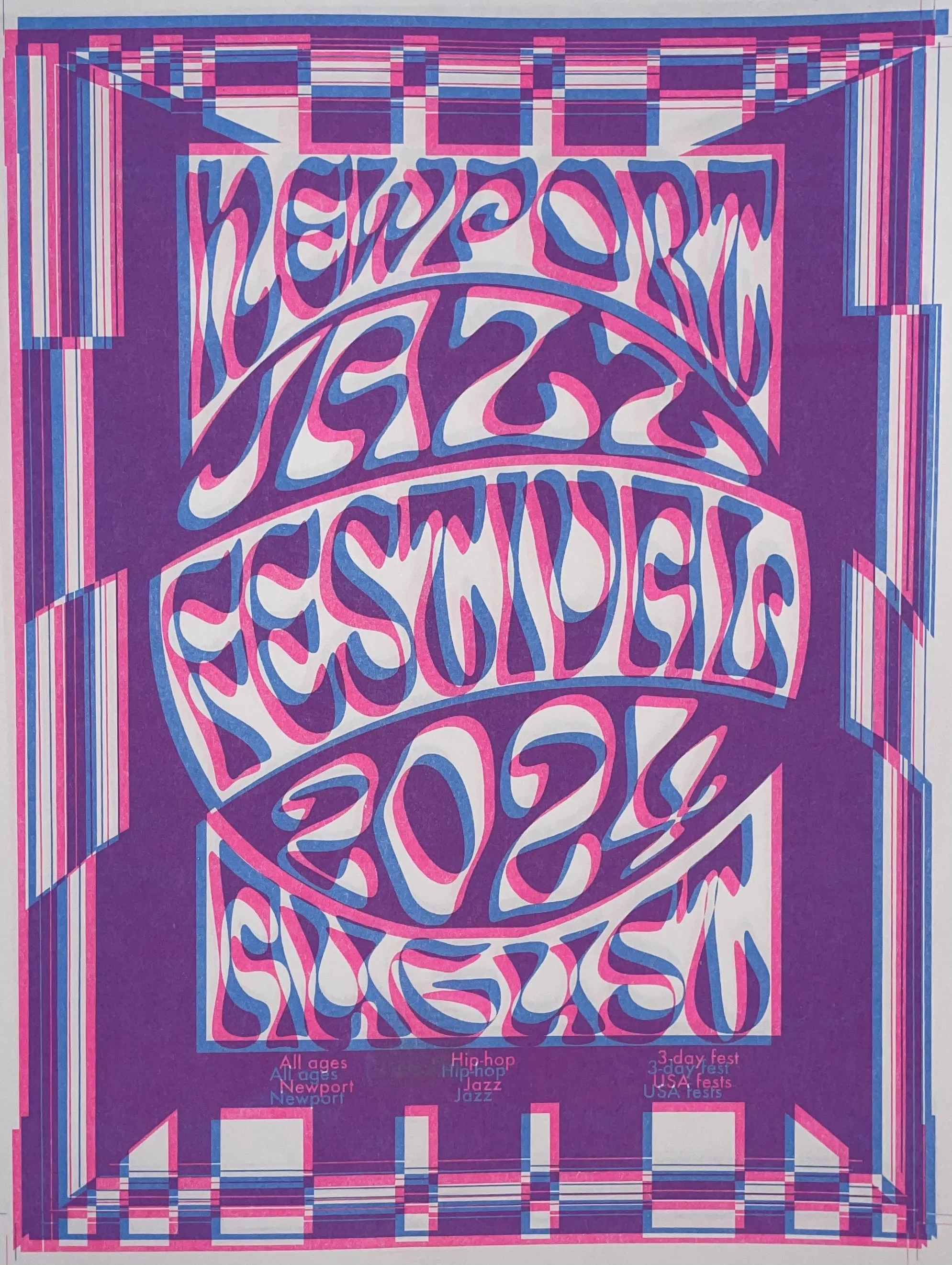
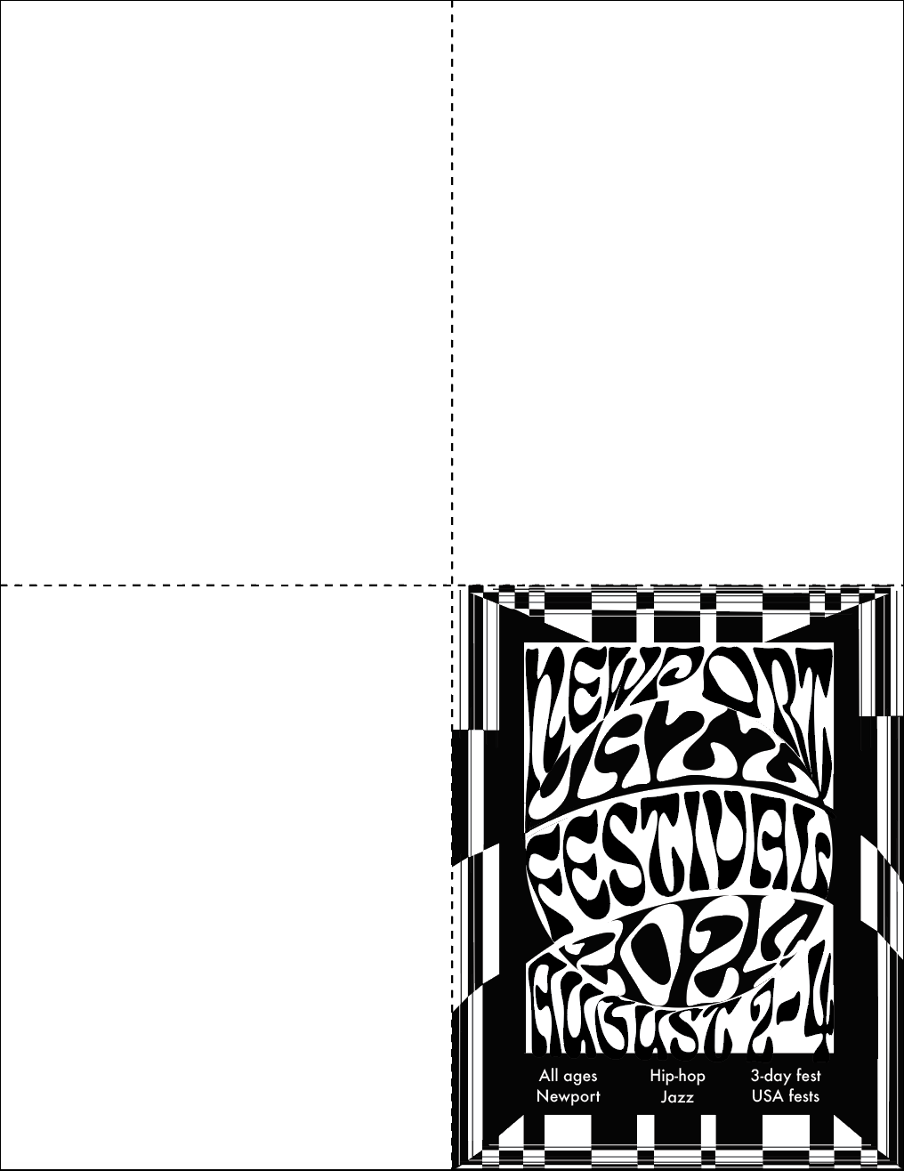
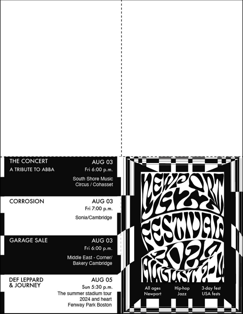
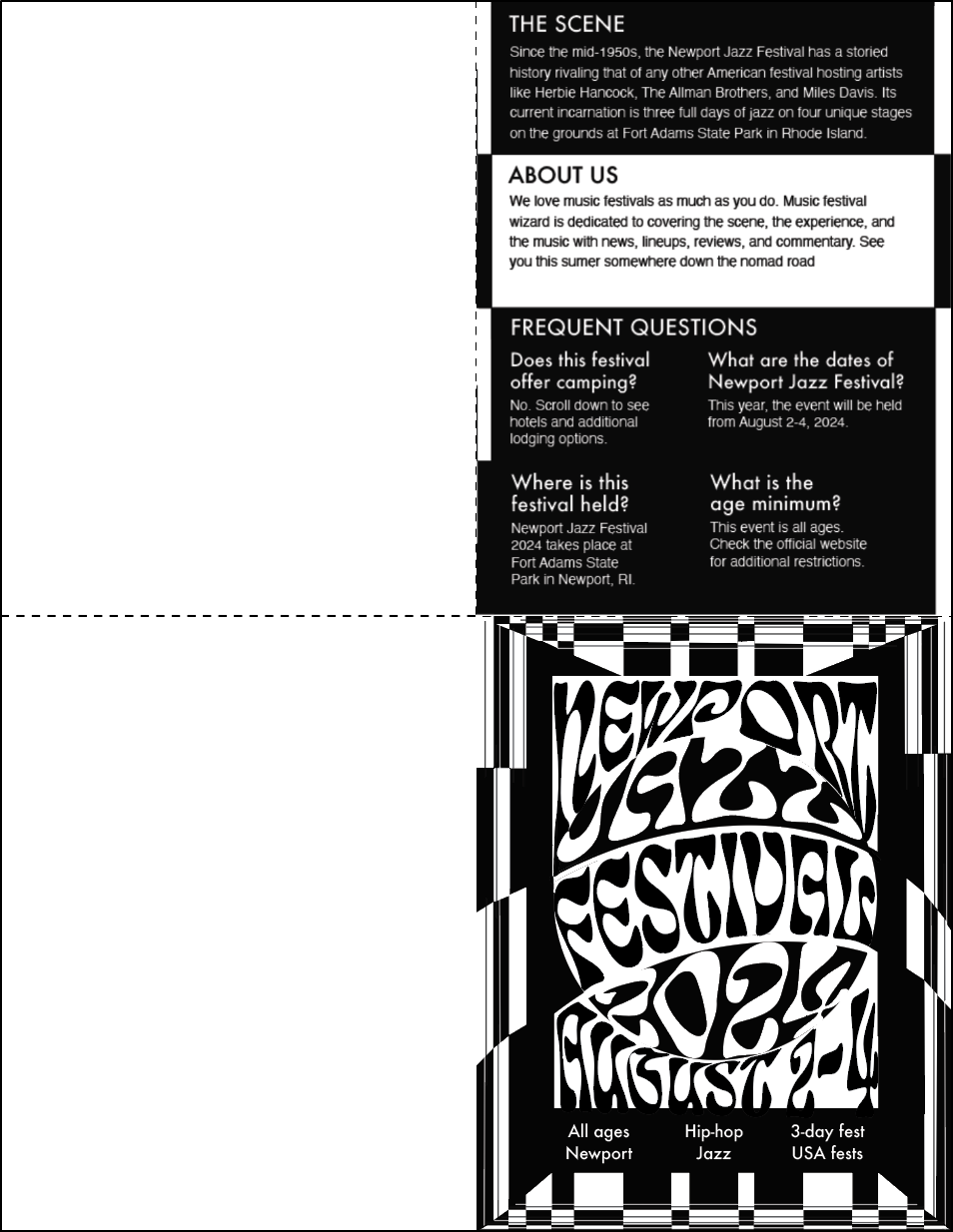
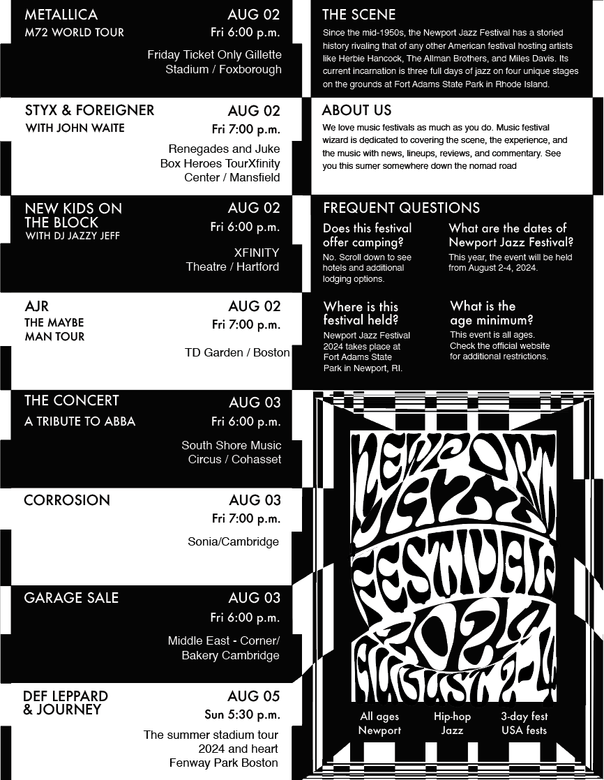
Newport Jazz festival blurs the lines between contemporary, classic, and experimental music, drawing crowds from all demographics. I reflected its boldness through type manipulations that echo into a checkerboard design. The checkerboard is a symbol of diversity and an eye-catching rhythmic motif that brings the viewer into the main composition
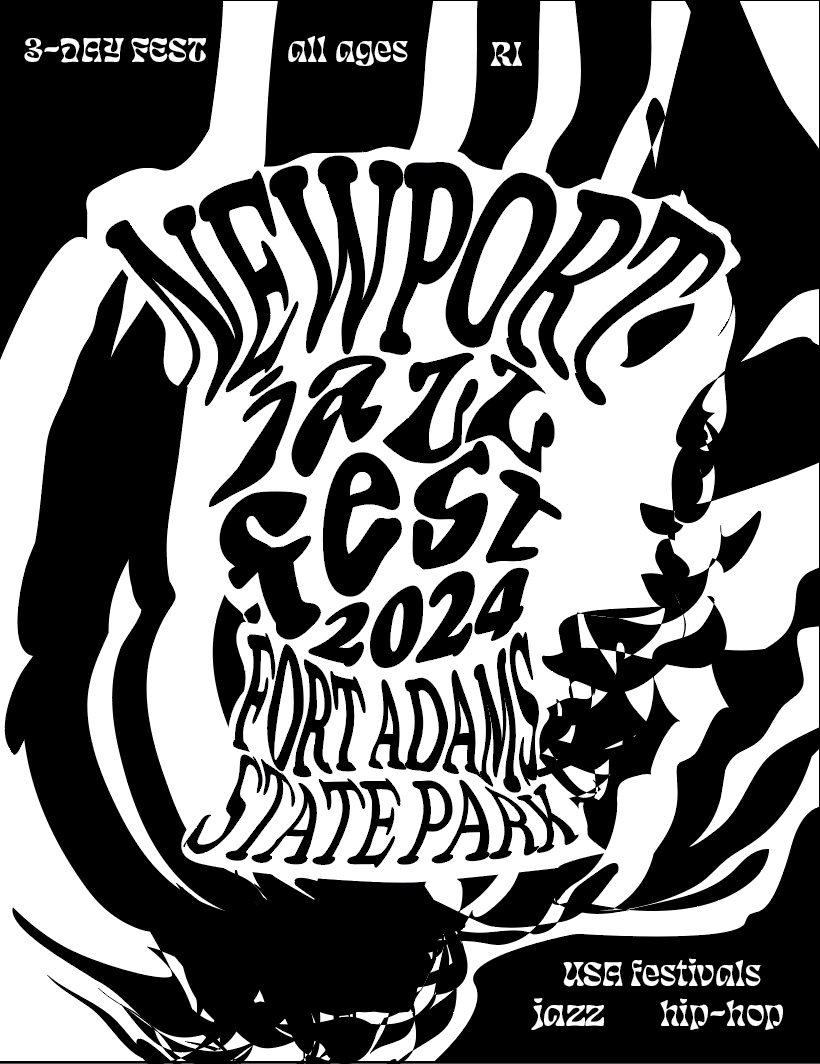
Back cover
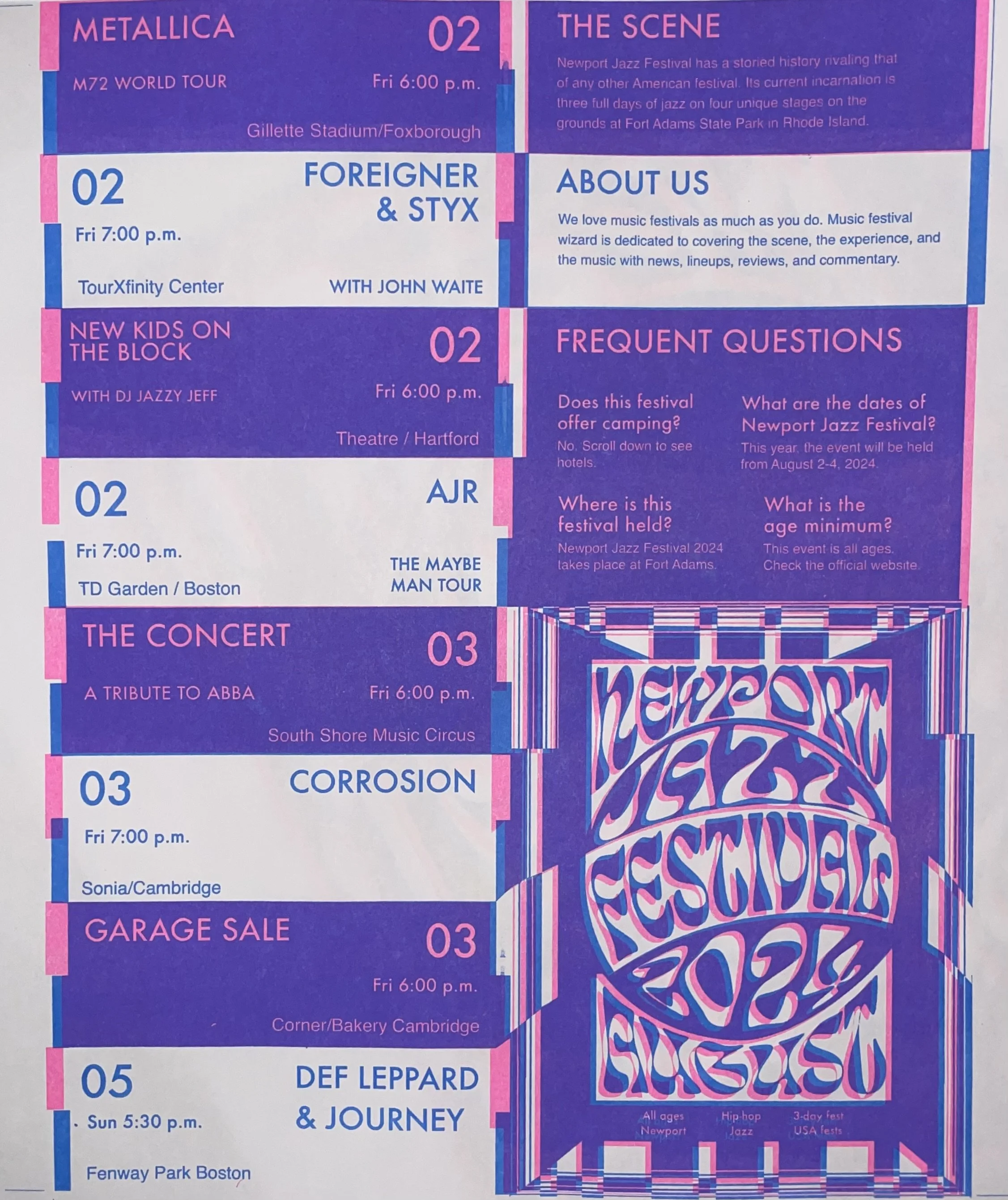
I repeated the checkerboard motif on the back cover as a means of creating a cohesive design, as well as to organize the information effectively. The cover is difficult to define by design, but the inside is generous with its readability to the viewer while drawing a meaningful relationship between the cover.

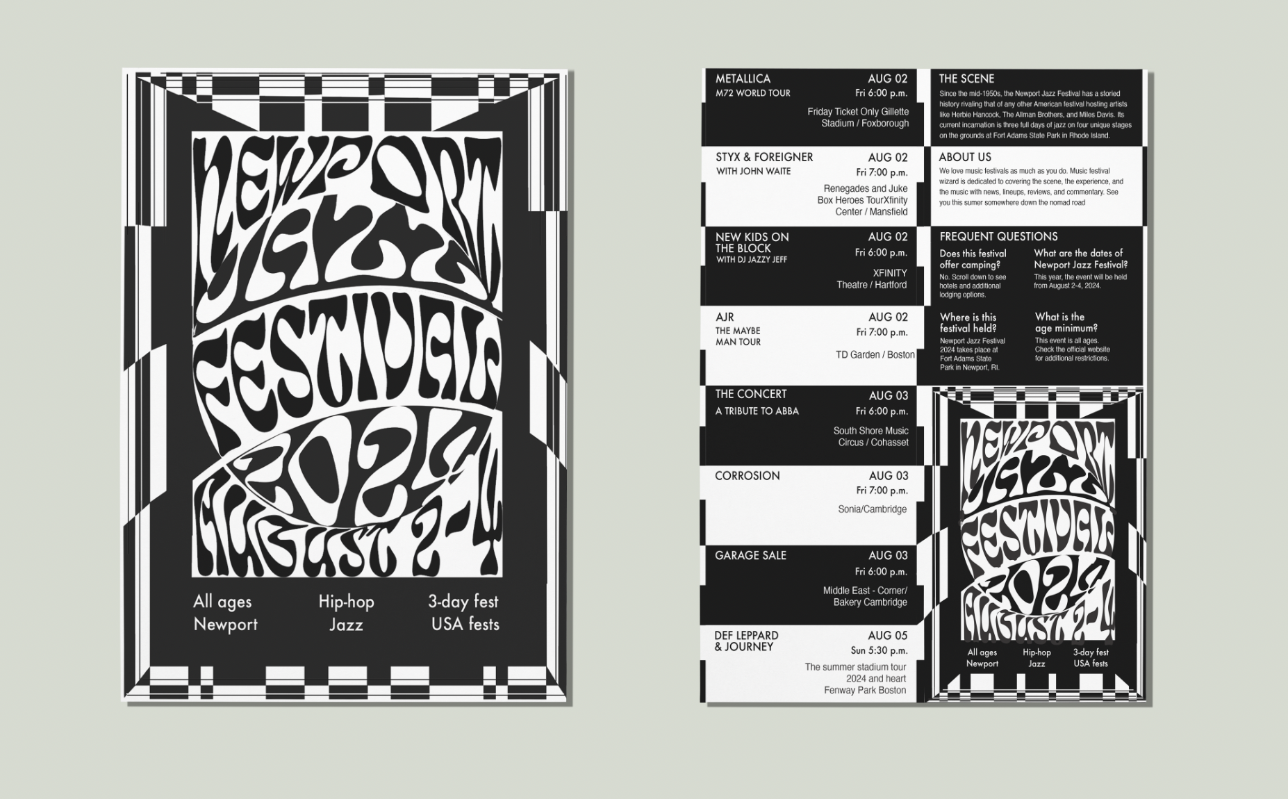
Risograph print
Upon the completion of the poster front cover, I created a risograph version using a double take printing technique. I off-registered the secondary print layer to create a chromatic abberation effect that enhances the visual impact of the posters motion while enhancing the checkered motifs present throughout the design.
Horizontal Unfold
1.
Vertical Unfold
2.

1.
2.
3.
3.