Beer Can Illustration
For my beer can illustration project in my illustration class, I was tasked with emulating the style of a popular beer can while developing my own original imagery, concept, and flavor. I chose to draw inspiration from New Hokkaido, a brewery known for its use of flat colors, consistent line weight, and bold contrasting palettes, all while incorporating traditional Japanese mythology and motifs.
Design 1
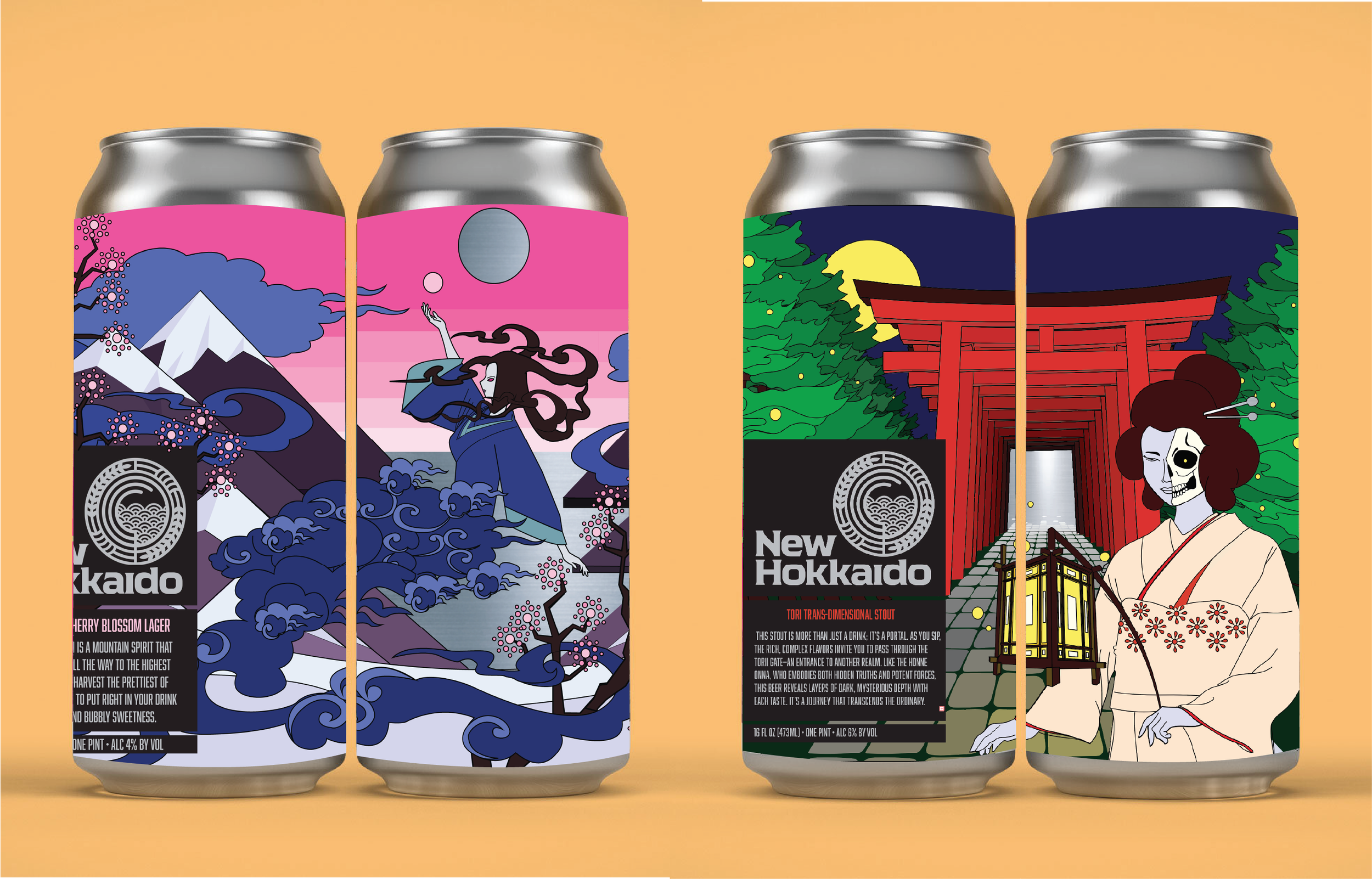
This design was created to embody a beer that is light, airy, easy to drink, and flavorful. I chose cherry blossom as the key flavor, tying it back to the historical and cultural themes of Japan, which heavily influenced the visual direction of the can. Inspired by Japanese mythology, I based the central figure on the wind sprite—a gas-like woman who soars above mountaintops, searching for the perfect blossom for her concoctions.
Receding color fields create a sense of depth and expansion, while the color palette reinforces the beer’s sweet and delicate flavor profile. Design elements and motifs draw from traditional Japanese woodblock prints, resulting in a can that is both visually striking and dynamic, maintaining interest as it turns in the hand. the circle in the background is cutout to reveal the reflective metal of the can, emulating the shining of the sun and drawing the viewer in from afar.
Design 2
For my second design, I aimed to deepen the influence of Japanese mythology. The goal was to represent a beer that is stiff and strong yet deceptively flavorful. I was drawn to mythological elements that symbolize transitions between worlds, reflecting how the beer itself can transport the drinker if they don’t pace themselves.
I designed my own interpretation of Hone Onna, a spectral figure from Japanese folklore known for seducing men to their doom. She illuminates the path before a torii gate, a traditional symbol of passage between the worldly and spiritual realms. Much like my first design, I sought to create depth through an otherworldly and psychedelic recession of trees and the torii gate, vanishing into the horizon where the can’s metallic surface is revealed—suggesting a portal to another world. The bold, contrasting color palette reinforces the beer’s weight and strength, making for a striking and immersive visual.
What I learned from this design
Illustrating in a color-blocked style was a departure from my usual maximalist approach, where I typically design with fewer restrictions. This design taught me how to work within limitations and use them to unlock new avenues of creative expression. The color-blocked style I explored here went on to inform future projects, including the graphics for my sardine tin belly-band.


